Picture yourself in an unfamiliar airport with a tight connection to catch. Or walking into a large hospital to find a relative before visiting hours end. In both moments, your mind asks the same three questions: Where am I? Where do I need to go? How do I get there? Effective wayfinding signage answers those questions for you before stress sets in, using signs, symbols, colors, and visual cues.
This guide explains what the five principles of wayfinding signage are, why each one matters, and how to apply them in real buildings and spaces. By the end, you will know how good signage helps people find their way without stopping to work it out.
The Five Principles of Wayfinding Signage
The five principles work together as one system. A single landmark or a clever color scheme is not enough by itself to guide someone through a large building. Used together, they create a space that feels easy to read from the front door to the final destination.
Here is a quick summary before we look at each in detail.
Directional signs at decision points, reassurance signs
Simplify navigation choices
Prevents overload and speeds up decisions
Information hierarchy, short messages, pictograms
Principle 1: Use Landmarks for Orientation
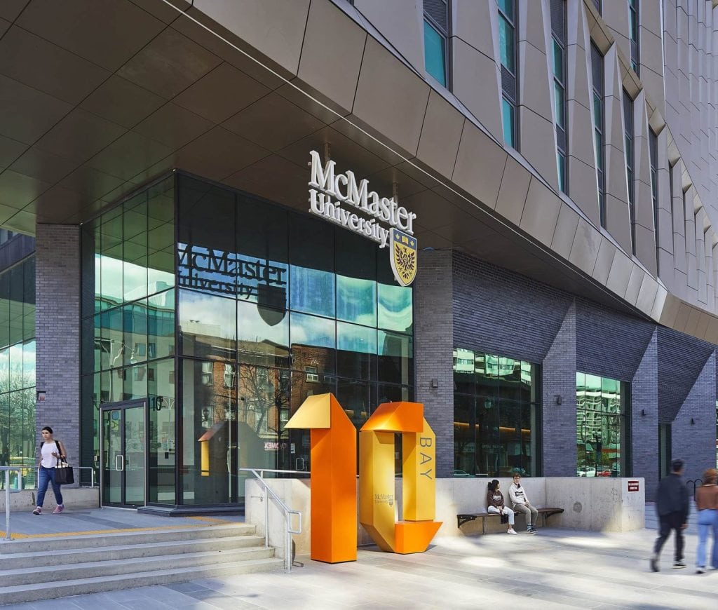
A landmark is any object or feature that stands out and sticks in your memory. A tall sculpture, a bold feature sign, a striking staircase, or a distinctive piece of architecture can all serve this role. People use landmarks to answer the most basic wayfinding question of all: where am I?
How Landmarks Give You a Sense of Direction
When you know where a landmark sits in relation to you, you also know something about your own position and direction. This is why people give directions like “turn left at the fountain” instead of naming a street they cannot see. A good landmark gives visitors a fixed point they can steer by, which makes the whole space easier to hold in their heads.
Research supports this. A peer-reviewed review of wayfinding studies found that people rely on landmarks for three main tasks: identifying a specific location, finding a route to it, and orienting themselves to check whether the path they have chosen is correct. The same behavior that guides people through a city works inside a museum, a mall, or an office.
Wide-visibility Landmarks and Close-range Local Cues
Some landmarks work across a whole space. A large feature visible from far away helps people judge their position over a wide area. Others are local cues that only appear once you are close, such as a distinctive artwork at a lift lobby. Both are useful. A strong system often pairs one or two major landmarks with a set of smaller local cues so people stay oriented as they move.
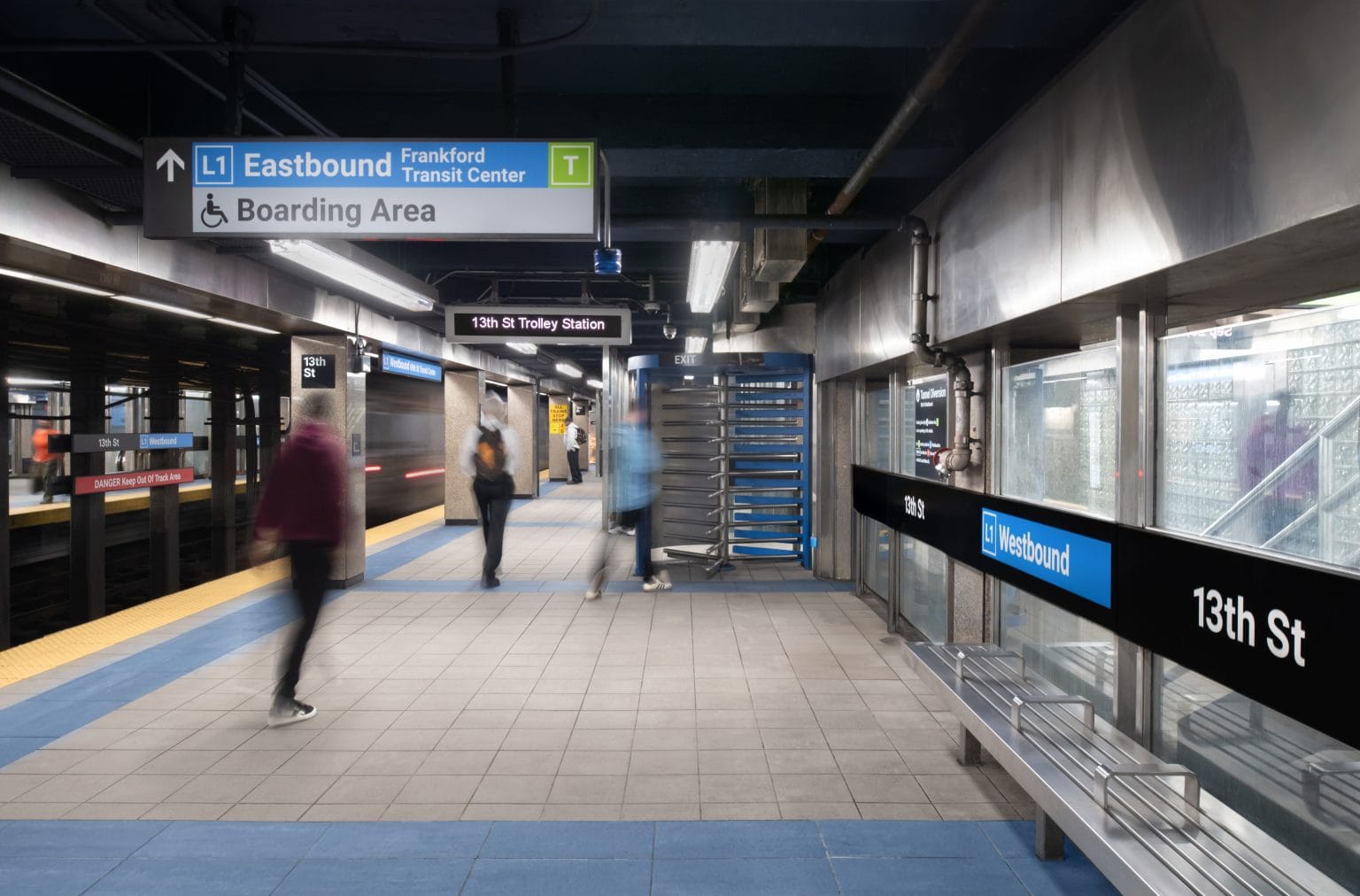
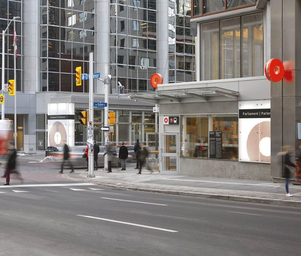
You can see this idea at work in Entro’s Branding and Wayfinding Master Plan for SEPTA, the transit authority serving five counties around Philadelphia. Tall, branded pylon signs stand as visible markers that riders can spot and steer by across a station. On a wider scale, Entro gave each rapid transit line its own color, letter, and name under a single SEPTA Metro identity. A rider can anchor their whole trip to a reference they recognize, such as the orange line or the B Line, instead of tracking a string of unfamiliar station names.
Principle 2: Create Distinct Wayfinding Zones
Large spaces become far easier to understand when you divide them into zones. A zone is an area with its own visual character that sets it apart from the rest of the building. This gives people another way to answer “Where am I?” without reading a single word.
Using Color, Materials, and Visual Character to Define an Area
The most common way to mark a zone is color, though materials, lighting, and graphics all help. The point is consistency. When one part of a building keeps a shared look throughout, people learn to associate that look with that area. Cross into a different look, and they know they have moved somewhere new.
Entro’s work for Niagara College Toronto shows this well. The college opened a campus inside a heritage building it shares with other tenants, so telling the college’s space apart from the rest was the first job. Entro used big, bright graphics to define the levels and areas that belong to the college and extended the college’s own color palette across those spaces. The result is that each part reads clearly as college territory and sets itself apart from the neighboring tenants.
How Crossing a Zone Boundary Tells Visitors Where They Are
The edge of a zone gives people a useful signal. When the color or material shifts, a visitor gets a small signal that they have crossed into a new part of the building. That signal helps them track their progress and correct course if they have gone the wrong way. At Niagara College Toronto, the move from a neighboring tenant’s space into the college’s bright, branded graphics tells students at once that they have arrived in the right place. The graphic program clearly marks off each area, so people always know which part of the building belongs to the college.
Zones in Airport Terminals, Parking levels, and Multi-building sites
Zoning is a natural fit for any large or complex site. Airport terminal zoning is used to separate arrivals, departures, and gates. Parking structures use color and numbering so you can find your car days later. Campuses with several buildings use it to group related spaces. The larger and more confusing the space, the more a clear zone system pays off.
Principle 3: Give Each Location a Clear Identity
Where zones group areas together, identity makes each individual place feel distinct. If every hallway, floor, and room blends into the next, people lose track of where they are. Giving each location its own recognizable character solves that.
Why a Recognizable Sense of Place Helps Orientation
People remember places that feel different from one another. A floor with its own color and graphics is easier to recall than a floor that looks like every other. That memory becomes part of how someone navigates the building on their next visit. The goal is not decoration for its own sake. It is to give each place enough character that a visitor can say, “I have been here before,” and know where they stand.
Using Typography, Color Palettes, and Consistent Cues
Identity comes from the same tools as zoning, used at a finer level: typography, color, graphics, materials, and clear naming. The trick is to make each place distinct while keeping the whole system feeling like one family. Too much variation looks chaotic. Too little makes everything blur together.
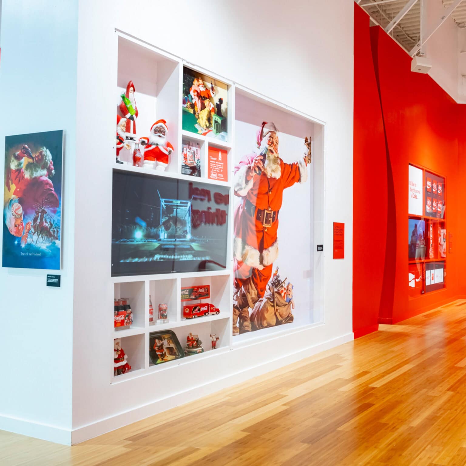
Entro’s ICONS exhibit for the World of Coca-Cola in Atlanta is a good example. Working with the museum’s creative team, Entro filled the 1,700-square-foot space with the brand’s signature elements, from the Spencerian script logo to the contour bottle and the three-dimensional ribbon that runs through the central wall. A larger-than-life Coca-Cola script marquee, which once sat on top of the building, greets visitors at the entrance. Every part of the exhibit carries a clear, recognizable Coca-Cola identity, so visitors always know exactly whose space they are in.
Identity Across Wings, Floors, and Departments
The same thinking scales up to hospitals, offices, and large campuses, where wings, floors, or departments each get their own recognizable look. Give each one enough character to feel distinct while keeping them part of one visual family, and people can hold a clear mental map of the whole building. In the ICONS exhibit, that same discipline keeps the separate display areas feeling connected, even as each one explores a different piece of Coca-Cola’s story.
Principle 4: Design Clear Wayfinding Paths
A path is the route a person follows to get from where they are to where they want to be. A well-designed path carries someone smoothly through a space, confirming along the way that they are still headed in the right direction.
The Signs of a Route That Works
A route works when it has a clear beginning, a clear middle, and a clear end. People should sense their progress as they move. A path that keeps a shared visual thread while still changing enough to show movement does this well. Long, unbroken corridors with no cues are where people get lost, so a good path breaks the journey into readable steps.
Placing Signs at Decision Points With Strong Visibility and Lighting
The most important signs sit at decision points, the spots where a person has to choose which way to go. Intersections, lift lobbies, stairwells, and entrances are all decision points. A directional sign placed just before one of these, where people can see and read it in time, keeps them moving without stopping. Visibility and lighting matter here. A sign that is hard to see or poorly lit is the same as no sign at all.
Reassurance Signs in Hospitals, Campuses, and Transit
Between decision points, reassurance signs tell people they are still on the right route. These small confirmations reduce doubt on long journeys through hospitals, campuses, and transit systems.
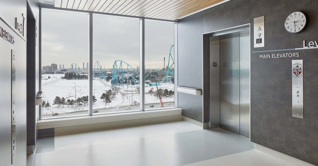
Entro’s program for Cortellucci Vaughan Hospital in Ontario shows how this works in a demanding setting. Working with the architect, Stantec, Entro took cues from the way people move up and down through the building, then used directional signs and wayfinding kiosks to guide patients, visitors, and staff from the entrance to their destination. The path stays clear even in a large, multi-floor space that could easily feel overwhelming.
Principle 5: Simplify Navigation Choices
The final principle is about restraint. When people face too many choices or too much information at once, they slow down and make mistakes. Good wayfinding removes clutter and gives people only what they need at each step.
How Trimming Options Prevents Information Overload
Every extra piece of information competes for attention. A sign crammed with destinations is harder to read than one that lists the few that matter at that spot. By trimming the options and showing only what is relevant to a person’s likely journey, you make decisions faster and easier.
A transit map is a good way to picture this. A map that shows every track, siding, and depot in exact geographic detail is accurate, but it buries the one thing a rider needs: which line to take and where to change. A stripped-back, stylized map that shows only the useful information is far easier to read at a glance. The same rule applies to any sign. Show people what helps their journey, and leave the rest off.
Structuring Content into Primary, Secondary, and Local Signs
A clear information hierarchy sorts signage into layers. Primary signs point to major destinations, secondary signs guide people toward specific areas, and local signs identify the exact room or space. This layered order means people see broad direction first and fine detail only when they need it. It keeps each sign simple while the system as a whole still covers everything.
Keeping Messages Short
Short, plain messages beat long ones every time. Universal symbols and pictograms often say more than words, and they cross language barriers in an instant. A restroom icon, an arrow, or an accessibility symbol is understood the world over. Pairing a simple icon with a few clear words gives people what they need without making them stop and read. The fewer words a sign needs to do its job, the faster people move through the space.
Accessibility and ADA Compliance Behind Every Principle
Accessibility is not a sixth principle. It runs through all five. A wayfinding system only succeeds if every person can use it, regardless of their sight, mobility, language, or cognitive needs. Designing for that from the start makes the whole system stronger.
In the United States, the Americans with Disabilities Act sets the baseline for accessible signage in public buildings. These rules cover things like raised tactile characters, Braille, sans serif fonts, strong contrast, and the height at which signs are mounted, so people who read by touch or from a wheelchair can use them comfortably. Wayfinding systems may also incorporate tactile maps to help people understand the layout of a space through touch.
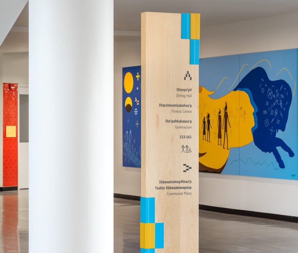
Good practice goes beyond the legal minimum. Entro’s work for Covenant House New York shows how accessibility and warmth can work together. The 80,000-square-foot facility serves homeless, runaway, and exploited youth, and all of its signage is bilingual in English and Spanish and ADA-compliant. Color marks each area of the building, and icons that follow the same color palette allow people to understand the space beyond the two written languages.
Designing this way from the outset, rather than adding it at the end, is what lets a single system serve everyone who walks through the door, whatever their sight, mobility, language, or reading ability. Accessibility is not an extra layer on top of good wayfinding. It is part of what makes wayfinding work at all.
Applying the Five Principles Across Different Environments
The five principles stay the same everywhere, but the way you apply them shifts with the setting. An airport has different pressures than a museum, and a hospital has different needs than a college.
The table below shows how the principles adapt, with a real Entro project for each.
Even a well-meaning wayfinding system can fall short. Most failures come down to a handful of avoidable mistakes.
Clutter. Too many signs, or too much on one sign, overwhelms people and slows them down. Cut back to what matters at each point.
Inconsistency. Different fonts, colors, or names across a building confuse visitors and break their trust in the system. Keep the whole family of signs consistent.
Poor placement. A sign that arrives after a decision point, or one that people cannot see in time, does not help. Place signs where people actually pause to choose.
No hierarchy. When every sign shouts equally, nothing stands out. Order your information from broad to specific so people find their way in steps.
Neglected maintenance. Faded, damaged, or out-of-date signs quietly undermine a whole system. A wayfinding program needs upkeep to keep working over time.
Avoid these five, and your signage will guide people instead of frustrating them.
How These Principles Come Together in Practice
The five principles work best together. When landmarks, zones, identity, clear paths, and simple choices are planned as one system, people move through a space with far less effort. Reaching that point takes research and planning as much as good signage.
This is the work Entro does. As an experiential design firm founded in Toronto in 1990, Entro takes a research-led approach to wayfinding. The team studies how people move through a space, using methods such as eye-tracking, pedestrian flow modeling, and space syntax analysis, then designs the signage around what they find. Accessibility is treated as a starting point, and wayfinding as the whole journey a person takes, not only the signs along the way.
If you are planning a wayfinding system for your building or site,get in touch with Entro to talk through your space.
The Bottom Line
The five principles work best as a set: landmarks to help people orient, distinct zones, a clear identity for each place, well-structured paths, and simple choices at each turn, all held together by accessibility.
Apply them together and a confusing building becomes one people can read with ease. Get them right, and visitors find their way with far less stress and confusion.
FAQs
What are the five principles of wayfinding in signage?
The five principles of wayfinding in signage are to use landmarks for orientation, create distinct zones, give each location a clear identity, design clear paths, and simplify navigation choices. Together they help people answer where they are, where they are going, and how to get there.
How many principles of wayfinding are there?
There is no single fixed number. Many wayfinding systems are built around five core principles, but some sources list more, adding factors like clarity, consistency, and accessibility. The five in this guide cover the essentials that most effective systems share.
What is the difference between wayfinding and signage?
Signage refers to the individual signs themselves. Wayfinding is the larger system and experience that helps people navigate a space, of which signage is one part. Good wayfinding also includes layout, landmarks, color, and the whole journey a person takes.
How do you make wayfinding signage ADA compliant without hurting the design?
You build accessibility in from the start rather than adding it at the end. Use raised tactile characters, Braille, sans serif fonts, strong contrast, and correct mounting heights, and fold them into a design that still uses your colors, materials, and brand.
Which wayfinding principle matters most?
No single principle stands above the rest, because they work together. That said, simplifying navigation choices often has the biggest immediate effect, since clutter and overload are the fastest way to leave people confused. The strongest systems apply all five in balance.