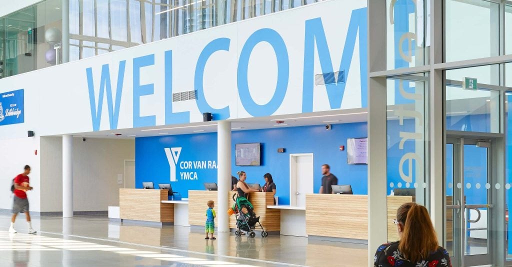
Think about the last building that gave you no trouble. You walked in, found the desk, the gate, or the exit, and never once stopped to wonder which way to turn. Perhaps you don’t remember it at all. When wayfinding works, it disappears. Wayfinding signage underpins that sense of ease. It isn’t decoration added at the end of a project; it’s the system that tells people where they are, where to go, and that they have arrived.
This article looks at why wayfinding is important from a few angles. how the brain reads a space, what happens to people when signage fails, and what separates a system that quietly works from one that leaves people lost.
What Is Wayfinding Signage?
Wayfinding signage is the system of visual and spatial cues, including directional signs, symbols, maps, color coding, and physical landmarks, that guides people through a building or an outdoor space. A single sign points; a wayfinding system does more, helping someone get their bearings, plan a route, and confirm they’ve reached the right place.
That difference is the whole idea. Wayfinding isn’t one sign doing one job. It’s a designed set of parts working together. The wayfinding experience begins when someone first looks up an address, books a ticket, or pulls into the car park. This is why Entro treats wayfinding as something that has an impact from the moment a visitor considers a destination to long after they’ve left.
How It Differs from General Signage
General signage tells you things: opening hours, a room name, and a rule to follow (e.g., no smoking). Wayfinding signage does something different. It guides you somewhere, working in sequence, one sign leading to the next, and it’s built around the trip a person is actually taking.
But the signs are only the part you see. The decisions behind them come first: what a person needs to know, where they’ll need to know it, and how the whole trip fits together. That work is wayfinding strategy, and most of it happens before a single sign is drawn.
General signage
Wayfinding signage
Wayfinding strategy
What it does
States a fact
Guides a journey
Plans the journey before it’s built
How far it reaches
One message
One route
Every route through a place, from the car park to the way out
Typical example
Opening hours, a room name, a “no smoking” notice
An arrow at a junction, a floor directory, a “you are here” map
Splitting a site into zones, naming and numbering that hold up, working out where people have to choose
When it’s decided
After the building is finished
Once the layout is set
Early, alongside the architecture
Who it’s for
Anyone who reads it
Anyone making a turn
Visitors, staff, and the people running the place
When it fails
You miss one fact
You get lost
The building works against the people in it
The Elements That Make Up a Wayfinding System
Most wayfinding systems are built from several types of signs and layers that work together to guide people clearly through a space.
Directional signs point people along their route and toward destinations, usually appearing at turns, intersections, and decision points where people need to choose a direction.
Identification signs help people recognize when they have arrived by labeling facilities, rooms, doors, departments, and specific locations.
Informational signs provide broader context, such as maps, floor directories, “you are here” plans, opening hours, and general service details that help people understand the environment around them.
Regulatory signs communicate important rules, safety requirements, accessibility information, and emergency guidance, including exits, restricted areas, stairs, and assembly points.
Tactile and digital layers make wayfinding more accessible by adding elements such as braille, raised lettering, and searchable digital screens that support more people and different situations.
On their own, each element serves a specific purpose. Together, they create one consistent visual language that helps people navigate spaces with confidence.
How the Brain Processes Wayfinding Cues
When you walk into an unfamiliar place, your brain gets to work straight away: hunting for anything that tells it where you are – a landmark, a sign, a change in color, a clear path. When those cues are missing, unclear, or contradictory, the mental work of figuring things out piles up. People feel it as stress, a sense of slowness, and a nagging need to stop and ask someone for help.
The brain likes patterns. It groups things that look alike, follows lines, and expects order, which are the ideas at the center of Gestalt psychology. Wayfinding that works with those habits feels easy; wayfinding that fights them feels like effort. That effort has a name: cognitive load, the amount of thinking a task demands. Every extra thing a person has to work out, whether a crowded sign, a wall of text, or an arrow that could have two meanings, adds to the pile and leaves less attention for the reason they came.
Research backs this up. A 2025 study of airport signage found that packing too much onto a sign, or relying on text alone, raised people’s mental effort and left them less sure of their choices, while signs that paired words with clear graphics held up better, especially when travelers were short on time. Other eye-tracking work shows what goes wrong when signage is thin: people’s eyes land again and again on doors, blank walls, corners, and ceilings that carry no information, while the cues that would actually help go unseen.
Cognitive Load and Navigation Stress
The cost of all this isn’t only mental; it’s physical. When people get lost in a hospital, the difficulty can tax them emotionally, raising blood pressure and heart rate, thus adding to frustration, fatigue, and anxiety․ That toll lands hardest on older adults, patients who are already unwell, or anyone racing a clock. By the time they reach the door they need, their state has already slipped before the appointment, the flight, or the meeting has even begun.
What Happens When Wayfinding Fails
The scale of this problem shows up in the numbers.
Research byDeloitte Digital found that more than 85% of people ask for directions when they visit a hospital, and close to a third of first-time visitors get properly lost. That confusion carries a price: staff at one 300-bed hospital were found to spend about 4,500 hours a year helping people find their way, which works out to roughly $220,000 in staff time. And it isn’t only hospitals.
Why Wayfinding Signage Design Matters: Six Reasons
There’s no single reason why wayfinding signage matters. It works across six connected areas at once, each with real consequences for the people using a space and the people running it.This is where the answer to why wayfinding is important gets specific.
1. It Reduces Stress and Improves the Visitor Experience
Clear signage reduces the mental effort of getting around, freeing people to focus on why they came. This is the part most explanations skip: finding your way is a cognitive task, and every unclear sign or missed turn adds to a person’s cognitive load. Lighten that load, and you lighten the feeling that rides on it. It matters most where people arrive on edge, in a hospital, on a first day at a new campus, or at an airport before a tight connection, because reducing the guesswork reduces the emotional strain.
A hospital navigation study found that people using a clear, real-time guidance system reached their destination faster, made fewer wrong turns, and reported lower anxiety and mental workload than those left with a traditional paper map. The best of this work goes unnoticed. Visitors don’t praise the signs; they just reach their destination and never think about them.
2. It Supports Safety and Emergency Readiness
In an emergency, people fall back on what they can see. Exit signs, evacuation routes, and clearly marked assembly points can be the difference between a calm, orderly exit and a dangerous crush. Meeting fire and building codes is the starting line here, not the finish.
Good safety signage is read correctly under pressure when no one has time to puzzle over it. In a hospital, the same thinking covers zone identification, so staff and visitors can place themselves fast when it counts.
3. It Makes Spaces Accessible and Inclusive
Good wayfinding meets a lot of needs at the same time. A first-time visitor, someone with low literacy, a person with low vision or a cognitive impairment, and a traveler who reads little of the local language all lean on the same things: clear signs, tactile lettering, readable type at the right size, high-contrast color, and the internationally standardized pictograms (ISO 7001) that read the same to everyone.
This is where accessibility stops being a box to tick. Designing for the full range of people doesn’t narrow a system; it makes it clearer, calmer, and easier for everyone who uses it. And it is a matter of dignity as much as function: a person who can find their own way, without having to ask or wait for help, is treated as an equal user of the space. In airports, civic buildings, and hospitals, that often means signs that work across several languages, so no one is left out at the moment they most need help.
4. It Improves Operational Efficiency
When people can find their own way, staff aren’t pulled aside to give directions every few minutes. Those interruptions are small on their own, but they add up, and they don’t only cost time.
In a survey of US hospital staff, each staff member spent roughly half an hour a week helping people find their way, and nearly 44% had, at some point in their careers, faced incivility from people frustrated at being unable to find their way. Every one of those moments pulls a nurse or receptionist off the work that counts.
When a front desk spends more of its day pointing people down hallways than anything else, the signage is working against the building. Clearer routes also ease bottlenecks and get people moving, so good wayfinding gives staff their attention back and gives visitors a calmer arrival.
5. It Reinforces Brand and a Sense of Place
Signage is never neutral. The typeface, the materials, the colors, and the tone of the words are all design choices, and together they tell people something about the organization behind the space and how much it cares about them.
A system that has been thought through reads as calm and confident; one that was an afterthought reads that way, too. This is where wayfinding stops being plain infrastructure and becomes part of the experience itself, carrying a brand the way a logo or a building does and shaping how a place feels and how people remember it.
6. It Builds Trust and Visitor Confidence
There’s a quiet message in a sign placed exactly where you needed it: we thought about you. When people can get around on their own, with dignity and without asking for help, their sense of the place and of the people who run it goes up.
First impressions form fast, and for a first-time visitor, they often form on the walk from the door to wherever they’re headed. Confusion at that stage colors everything after it, which is why ease of getting around shows up later in satisfaction scores and whether people come back at all.
Where Wayfinding Signage Has the Highest Impact
How much wayfinding matters depends on the place. The more complex the building and the higher the cost of getting lost, the more the design earns its keep. Entro’s wayfinding signage by industry shows how the emphasis shifts from one setting to the next.
Healthcare
Hospitals are the hardest test. People often arrive stressed, unwell, or worried about someone else, then face a maze of floors, wings, and departments that shift as the building grows. Getting lost here isn’t a minor annoyance. It delays care, raises blood pressure, and leads to missed appointments. Even when signage is decent, it often isn’t enough on its own: in one hospital study, 98% of visitors reached their destination, but most had to stop and check with staff to get there.
This is the kind of setting Entro’s healthcare wayfinding work is built for. At Mackenzie Health’s Cortellucci Vaughan Hospital, for instance, Entro split the building into color-coded zones with tactile, high-contrast, plainly named signs, so people of all abilities can find their way with less worry.
Airports and Transit
Airports pile every hard condition on top of one another: time pressure, big crowds, and travelers who speak many different languages. Signs have to work without words as often as with them, leaning on symbols everyone knows and a clear order of information, with the most important message first and the details after.
The 2025 airport study makes the case plainly: dense, text-heavy signs slow people down and shake their confidence, while signs that pair words with graphics hold up when it matters. Entro’s airport wayfinding on the new terminal at Kansas City International Airport was shaped around exactly these pressures, with community input guiding the messages, fonts, colors, and pictograms.
Campuses and Educational Facilities
A big campus asks people to find their way across many buildings, often with names and numbering that grew up over decades and don’t quite line up. New students, visiting parents, and anyone there for the first time need to get oriented quickly, usually on a day that’s already busy, and the campus signage has to make sense to a wide mix of people.
Campus and education wayfinding for Arctic College’s Nunatta Campus in Iqaluit shows what that can look like: a system built around pictograms and numbers with minimal text, working across four languages and two alphabets, and shaped by the community it serves, right down to washroom icons redrawn from the traditional amauti parka rather than the standard figures. Clear, culturally grounded signs like these help first-time visitors find their way and feel they belong.
Mixed-Use and Commercial Developments
A single mixed-use development can hold offices, shops, restaurants, and public squares, with a continuous stream of visitors and a mix of public and private areas. People need to sort out where they’re allowed, where their meeting is, and where they parked, often all at once.
Clear zoning, easy-to-read directories, and parking that leads naturally into the rest of the site keep the whole place legible. Entro’s work on the CIBC Square project in Toronto runs through this kind of layered, multi-tenant setting.
Cultural Institutions and Public Spaces
Museums, parks, theaters, and civic buildings welcome all sorts of people, many of them tourists or one-time visitors who won’t have the layout memorized.
Cultural Wayfinding here does more than point. It can introduce a collection, set up a route through a show, or hint at the story a space is trying to tell. Done well, it adds to the character of the place rather than cluttering it. That is the line Entro walks across in its cultural and civic work.
What Good Wayfinding Signage Design Looks Like
Good wayfinding isn’t luck. It comes out of a carefulwayfinding design process, and a few things separate a system that works from one that just fills the walls with signs.
Putting Signs Where Decisions Happen
Signs earn their place at the points where people actually have to choose: entrances, junctions, elevator lobbies, and the spots where one space hands off to another. A sign that shows up too late, after the turn, is useless; one that shows up too early, before there’s any context, gets ignored.
Working out where those moments fall is a big part of the job, which is why Entro studies how people move through a space, using site analysis and pedestrian flow modeling before a single sign goes up.
Hierarchy, Typography, and Visual Clarity
On any single sign, the eye should land on the most important thing first, the main direction, then drop to secondary destinations, then to the small supporting detail. Type has to stay readable from a distance while people are walking and in whatever light the space happens to have, which rules out grabbing a default font and hoping for the best. Signs that combine words with clear graphics are understood faster and hold up better under pressure than text alone.
Consistency Across the Journey
A wayfinding system has to speak one language from start to finish: the same typeface, the same color logic, the same set of symbols, and signs placed in the same way each time. When that consistency breaks, people have to relearn the rules at every turn, and that extra work drops straight back onto their mental load. Sameness, here, is a kindness. It lets people stop thinking about the signs and trust them instead.
Inclusive and Accessible by Design
Meeting accessibility rules is the floor, not the ceiling. A system that truly works for everyone builds in tactile lettering, high-contrast color, signs set at heights people can actually read, and symbols recognized around the world. Adding languages and leaning on symbols also helps people who read little of the local language or none at all. This is the thinking behind Entro’s inclusive-by-design approach: start from the full range of people who’ll use a space, and the design gets better for all of them.
Designing Spaces People Can Trust
Wayfinding signage isn’t a finishing touch stuck on at the end. It’s a designed system that shapes how a place feels from the moment someone arrives to the moment they leave.
It does two jobs at once: the practical one of moving people safely and without fuss, and the human one of helping them feel oriented, respected, and at ease. That is the real answer to why wayfinding is important: the spaces that take it seriously are the ones where people simply feel looked after.
If your building makes people stop and wonder which way to go, it is costing you more than you think. Connect with the Entro team to build a strong wayfinding system together.
FAQs About Wayfinding Signage
What is the main purpose of wayfinding signage?
Wayfinding signage helps people navigate unfamiliar environments independently and with confidence. Its primary purpose is to reduce disorientation, cognitive load, and stress by providing clear, consistent cues at every decision point throughout a space.
How does wayfinding signage improve the visitor experience?
By removing the friction of navigation, wayfinding signage lets visitors focus on their reason for being in a space rather than on how to get around it. A well-designed system reduces confusion, improves time-to-destination, and leaves a positive first impression.
What makes wayfinding signage effective?
Effective wayfinding signage combines strategic placement, visual hierarchy, consistent design language, inclusive symbols, and readable typography. It is designed around how people actually move through a space, not how architects or managers assume they do.
How does wayfinding signage affect operational efficiency?
Poor wayfinding forces staff to repeatedly give directions, delays appointments, and creates traffic bottlenecks. Effective systems reduce staff interruptions, improve visitor flow, and can measurably lower the cost of missed appointments or delayed access to services.
When does a space need professional wayfinding signage design?
When does a space need professional wayfinding signage design?
Any complex, high-traffic, or multi-destination environment benefits from professional wayfinding, including hospitals, airports, campuses, mixed-use developments, and cultural institutions. Clear indicators include frequent visitor confusion, staff fielding repeated directions, or a space undergoing renovation or expansion.