In the book and 2023 mini-series, All the Light We Cannot See, we are introduced to Marie-Laure LeBlanc, a French girl living through World War II. Marie-Laure is totally blind, and learns to navigate her town using a scale tactile model of Saint-Malo that her father built from repurposed wood. In the Netflix adaptation, the model is a work of art, conveying not just the overall structures of the town, but finer elements and details, like chimneys and rooflines. These are details that may be visible to partially- or fully-sighted people, but are only perceptible through touch for Marie-Laure. The model provides a tangible way for her to “see” the town, translating the information through a tactile, three-dimensional map.
It’s fiction, but the underlying concept is very real, and one we work with directly: raised-surface maps that help someone build an accurate mental picture of the space through touch. Everyone deserves a barrier-free world and the freedom to navigate with autonomy and independence. Tactile maps are one of the ways we can reduce barriers by providing visual information through other sensory means.
At Entro, we have gained insights into these questions through experience, and most importantly, through research and direct input from people who are blind. Accessibility is about designing with care, focus, and empathy—prioritizing what people need to navigate environments seamlessly and confidently.
What is a tactile map?
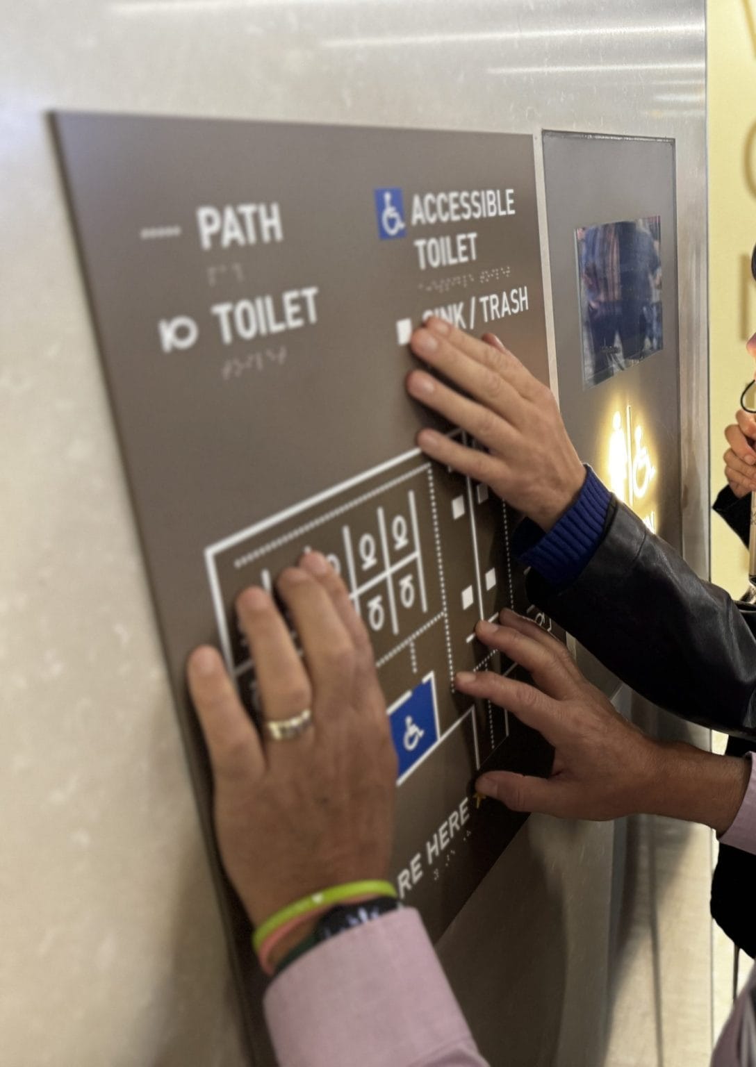
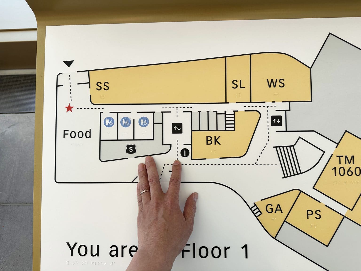
A tactile map includes everything you’d expect on a non-tactile map, but with additional enhancements to communicate to a blind or partially-sighted audience. Visual elements like architectural features and text are raised to be read by touch and paired with braille labels. A raised and dotted line may be included with the suggested path through the environment. Content must also be visually legible, with high contrast for partially-sighted individuals.
Tactile maps allow users to form a mental map of a space and rehearse a route before stepping foot into it, promoting well-being and independence.
It functions as an important pre-navigation tool to help orient the user in the environment. A tactile map provides a means to visualize, comprehend, and rehearse spatial relationships before physically beginning a journey. Providing this information up front reduces uncertainty, builds user confidence, and ensures that individuals can approach the environment with agency, not hesitation.
Accessible wayfinding for blind people
While there are a host of digital assistive devices that reduce barriers in a user’s journey, our focus in this paper is on designing an environment that works regardless of the user’s personal device access.
For someone with vision loss, tactile maps are one component of creating an accessible journey. Other touch-based accessibility tools include tactile floor pathways, as well as tactile lettering and braille on room identification signs, directional signs, directories, and handrails.
Additional sensory cues, such as sound, can aid in non-visual navigation. As part of our wayfinding research, we learned directly from blind people who described that their experience in locating restrooms in a busy airport was largely guided by environmental cues: running faucets, flushing toilets, and blowing hand-dryers.
A gap in guidelines and code
Accessibility codes in North America, including the Americans with Disabilities Act (ADA) in the United States and the Accessible Canada Act (ACA), have raised awareness and standards for accessible design, but there still is a gap between code and lived experience. Tactile maps represent an opportunity for improved accessibility and inclusivity in the built environment.
North American standards and guidelines offer little guidance on how to approach tactile map design — specifically what should be included, what to avoid, and what works well. To address this gap, we turned to international standards, particularly those in Japan, Hong Kong, and Singapore, where comprehensive tactile wayfinding guidelines have been developed. Through applied analysis of what made these tools successful, Entro has been developing tactile mapping systems for the North American market.
Two patterns stood out:
Multimodal cues matter. The most effective installations pair tactile maps with audio — an audible beacon signaling the map’s location, or a motion-triggered spoken summary, often in multiple languages. This tracks with something we already know about wayfinding generally: people process information differently, and redundancy across modalities (visual, tactile, audio) serves more people than any single format alone.
Design for blind users shouldn’t mean designing only for blind users. Many of the maps we studied had no visual text at all, and placed Braille directly over diagrams — legible by touch, but became unreadable to a sighted companion, a facility staff member, a low-vision user relying on high contrast print, or any other person using the map.
Through our research our team continues to refine our design philosophy and principles as we work with blind and low-vision people.
Nothing About Us Without Us: Designing with, not for
In developing tactile maps, it’s crucial to engage people with lived experiences early and throughout the research and design process to ensure we meet the needs of the people the tools intend to serve.
Lived experience with blindness or low vision is a form of expertise that can’t be substituted with best practices alone. Beyond considering best practices and contextual field observations, we gather the stakeholders in the early stages of research and design. Every new tactile map project has specific functional design goals, and must respond to the project-specific criteria.
Asking the right questions early in the project helps to establish that criteria, determine what best practice learnings can be applied, and what unique design challenges must be met for success.
Minneapolis St-Paul International Airport: A Case Study
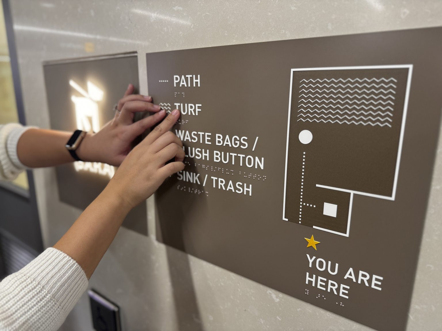
In 2020, working with the Minneapolis Airport Commission (MAC) at Minneapolis St-Paul International Airport (MSP) and Alliiance Architects, we designed a pilot tactile map program for a Pet Relief room. Throughout the design process, we tested designs with input from MAC’s Travelers with Disabilities Advisory Committee (TDAC) and the State Services for the Blind. Different people approached the same tactile map differently, and both perspectives helped shape the design.
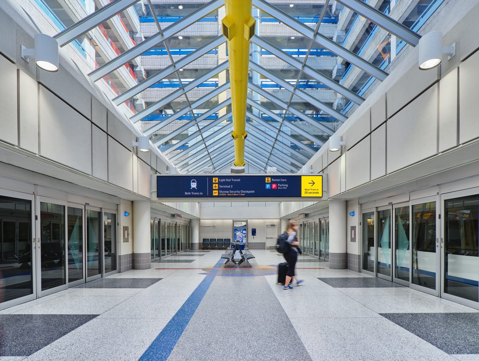
After the success of the pilot project, Entro began work with MSP in 2024 on a comprehensive program to roll out maps for all amenity spaces across the terminals. The destinations include restrooms with multiple stalls, individual-user restrooms, rooms with adult change tables, nursing rooms, lactation rooms, sensory rooms, and all pet relief rooms.
Given the wide variety of new map contexts, we re-engaged the disability community in testing through the design process, and were joined by a certified braille proofreader who was a part of the writing team for the recent updates to The Guidelines and Standards for Tactile Graphics (Braille Authority of North America).
Through this coordinated collaboration, we made amendments to MSP’s tactile map program to be carried through to 150 maps installed across the system.
Insights for Designing Tactile Maps
Simplicity
Reading by touch is a different experience than reading by sight. It’s slower and requires more effort on the part of the reader to convey information that would be scanned at a glance through a visual medium. Every added element — a redundant cue, an overlapping modality, an extra label — makes the map information harder to parse, not easier. More information can overwhelm rather than clarify.
Our role as designers is to make the information as accessible and easy to understand as possible, and it comes down to what’s essential: the right information at the right time.
Space constraints reinforce the need for essential information only. Accessibility guidelines for tactile lettering size, braille, and the buffer zone around raised elements makes space a premium on the sign. Every inch must be used thoughtfully and strategically. The map design should show only what’s essential for the user to create a rich mental image of the space.
Only the key destinations for the map’s context and defined user group should be included on the legend. When possible, use tactile labels directly on the map instead of listed in the legend so that there is less back-and-forth reading required by the user. In user testing, we observed how much added time it took blind users to read back and forth between the map and the legend. Direct labelling removed this friction entirely.
Consistency
Tactile maps should follow the same layout logic every time across a shared design system. Information must be easy to find, and placed in a predictable manner on the map. This includes consistency in where the legend is located, the same text heights, raised line widths, symbols, the overall size of the map, mounting heights, and reach distances must all be considered during the design process. The same consistency should also extend to related tactile elements throughout the building, such as room signage.
Scale
Exact proportional scale is often imperceptible to someone who is reading a map, making it more effective to use scale expressively to convey the experience of a space rather than its precise dimensions. What matters is relative position: the sink is opposite the toilet and next to the door — not exact dimensions.
Complicated architectural shapes need to be simplified down to essential information. The exact scale of the room is not as necessary as ensuring that elements are shown in the correct locations and are relative to one another. Expressive scale has more impact than literal scale.
Symbols Over Text
Our user testing at MSP showed a strong preference for simple, highly differentiated shapes for tactile legibility, compared to letters or numbers in most conditions.
Similar to visually perceived icons, tactile symbols are more memorable when they’re tied to a context like a toilet icon or the International Symbol of Access. Using contextual symbols also makes the map equally legible to sighted users.
If a symbol is too complex for tactile legibility, geometric shapes that are easy to distinguish from one another (triangle, square) are recommended. Patterns are recommended for covering areas instead of a fixed object, such as turf in a pet relief room, or a lactation room within a nursing room.
Based on user testing feedback, and consistent with The Guidelines and Standards for Tactile Graphics, a typical map should contain no more than five symbols and five patterns. For longer lists — such as a campus or building directory — letter codes tied to the space they represent (SC for Student Commons, MS for Makerspace) test better than arbitrary numbering.
Tactile Maps: A Tool for Improved Wayfinding
An important insight is the shift in how we think about tactile maps. They shouldn’t be designed only for individuals who are blind or partially sighted, as they serve a broad and diverse audience.
In tourism, tactile and multisensory objects help bridge language barriers by offering non-verbal intuitive access to information for non-readers, children, and multilingual visitors. In aging-focused and rehabilitation design, tactile maps support cognitive flexibility and retention of information, particularly for older adults. For multimodal learners or individuals with neurological, developmental, or cognitive disabilities, tactile maps provide a combination of visual and kinesthetic engagement through hands-on sensory exploration.
Beyond supporting spatial literacy and wayfinding, tangible maps enhance memory, build routines, and deepen conceptual understanding. Their broad utility highlights their role as not just assistive devices, but as powerful tools within inclusive, human-centered, and universally designed environments.
Marie-Laure’s wooden model of Saint-Malo was built for an audience of one. What we’re describing here scales that same idea to an airport terminal, a campus, a museum, or any environment that benefits from clarity in spatial information.
Framed this way, a tactile map isn’t a specialty accommodation with a narrow user base. It’s a better wayfinding tool that happens to be indispensable for some visitors and genuinely useful for nearly everyone else.
Looking ahead
Entro’s approach seeks to bridge the gap between people and public space, and to expand what wayfinding can be. None of what we’ve outlined here would be possible without the stories, experiences, and knowledge generously shared by the communities we serve with design. When it comes to accessibility, the most important takeaway is that the lived experiences of people are essential drivers to meaningful research and design.
Every tactile map project is different, just like the spaces we shape and people who move through them. These are best practices we have learned from listening and experience, and we look forward to being a part of the ever-evolving dialogue around barrier-free design, with diverse communities, and the active inclusion of their members in the design process.