Think about the last time you walked into a large hospital or a busy airport. You probably scanned the walls, looked for an arrow, and hoped it pointed you the right way. When the signs are clear, you barely notice them. When they are not, the whole visit feels harder than it should.
That feeling is what wayfinding signage is built to solve. Good signage helps people move through a space with less stress, fewer wrong turns, and more confidence. This guide walks through the main types of wayfinding signage, the wider tools that support them, how the right mix changes from place to place, and what it takes to build a system that actually works.
Understanding Wayfinding Signage and How It Works
Wayfinding signage is the set of signs that help people find their way through a building or an outdoor space. It covers the arrows that point you toward an exit, the room numbers on a door, the map in the lobby, and the safety notices near a stairwell. Each sign does a small job, but together they guide a person from the front door to wherever they need to be.
The goal is simple. People should be able to arrive, orient themselves, choose a direction, and reach their destination without asking for help at every turn.
Where Signage Ends and Wayfinding Begins
It helps to separate two words that often get used as if they mean the same thing.
Signage is the physical part. It is the actual sign on the wall, the symbol, the panel, the arrow, and the letters and numbers you read.
Wayfinding is the bigger idea. It is the full plan for how people find their way. That plan includes the signs, but it also includes the layout of the space, the sightlines, the landmarks, the lighting, and the choices a person makes at each point along the route.
A building can have plenty of signs and still be confusing if the wider plan is weak. A building with a clear layout and a few good signs can feel easy to move through. Signage is one tool inside the larger practice of wayfinding.
The Four Things People Need to Know in Any Space
Most navigation problems come down to four basic questions. A strong wayfinding system answers all of them.
Where am I right now? People need a sense of place before they can decide where to go next.
Where do I want to go? The destination should be easy to name and easy to spot on a directory or map.
How do I get there? The route needs to be clear at every point where a person might hesitate.
How do I know when I have arrived? People need confirmation that they have reached the right spot.
When signage answers these four questions in the right places, the space feels intuitive. When it misses one of them, people slow down, second-guess themselves, or go looking for a staff member.
These four questions aren’t just practical. Arriving somewhere is also a feeling. Reaching the right place brings a small sense of relief, and a space that is easy to read can make a person feel calm, safe, and like they belong there. A space that is hard to read does the opposite, adding worry on top of the confusion. Good wayfinding answers the practical questions and, in doing so, shapes how a place feels.
The 4 Types of Wayfinding Signage
Almost every sign in a wayfinding system falls into one of four groups. These four types of wayfinding signage each do a different job, and they work best when they support one another across the whole journey.
Here is a quick way to see how the four types compare.
Type
The job it does
Where it belongs
Examples
Directional
Points people toward a destination
Junctions and decision points
Overhead arrows, floor directories, exit signs
Identification
Confirms arrival and labels places
Doors, rooms, buildings, entrances
Room numbers, department names, building markers
Informational
Shares useful details and context
Lobbies, entrances, high-traffic areas
Maps, hours, “you are here” boards
Regulatory
States rules and safety requirements
Anywhere a rule or hazard applies
No smoking, fire exits, restricted areas
Signs That Point the Way: Directional Signage
Directional signage moves people toward a destination. These are the signs with arrows, and they belong at every point where a person has to make a choice, such as a junction, a hallway split, an elevator lobby, or a set of stairs.
The most important rule for directional signage is placement. A directional sign needs to appear before the decision point, not after it. If someone reads the arrow only once they have already passed the turn, the sign has failed even if the design is perfect. Consistency matters too. If a destination is called one name at the entrance and a different name halfway down the hall, people lose trust in the whole system.
Common examples include overhead signs at busy junctions, arrows pointing to restrooms or exits, and directory signs that list what sits on each floor.
Signs That Mark a Destination: Identification Signage
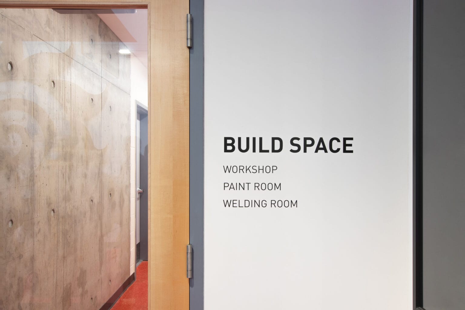
Identification signage tells people they have arrived. These signs label a room, a department, a floor, a building, or a landmark. They also help people confirm they are in the right place along the way.
Think of the sign outside a conference room, the number on a hotel door, the marker above a check-in desk, or the plaque naming a building on a campus. Identification signs should be easy to read at a glance and placed where people expect to find them. In many buildings, permanent room signs also need tactile letters and Braille that meet the ADA Standards for Accessible Design.
The value of identification signage is reassurance. It closes the loop that directional signage opens, so a person knows the trip worked.
Signs That Explain and Inform: Informational Signage
Informational signage gives people the details they need while they move through a space. It does not point anywhere. Instead, it answers common questions before people have to ask them.
You will find informational signage in lobbies, entrances, waiting areas, and other high-traffic areas. It covers things like opening hours, building maps and directories, “you are here” markers, available services, and where to find help. A directory near the front door that shows the full layout is a classic example.
Good informational signage helps people build a mental picture of the space early on. That picture makes every directional sign easier to follow later.
Signs That Set Rules and Keep People Safe: Regulatory Signage
Regulatory signage communicates rules, limits, and safety information. It sets the boundaries of a space and helps keep people out of harm’s way.
These signs are usually bold and direct, with a clear message and no clutter. Examples include no smoking notices, “employees only” markers, emergency exit and fire signs, accessibility notices, and safety warnings near equipment. In workplaces and industrial sites, regulatory signage is tied closely to safety rules and codes.
Regulatory signage may not be the most eye-catching part of a system, but it protects people and keeps a space orderly and compliant.
The Wider Layers of Wayfinding
Signs are the most visible part of wayfinding, but they are not the whole picture. In most real spaces, several layers work together. The best results come when the layers work together and point people the same way.
Physical Signs
This is the layer most people picture first. Room signs, directional arrows, directories, maps, and safety notices carry the core of the message. Physical signs work well when they are treated as a connected set rather than a pile of separate pieces, so names and symbols stay the same from the front door to the final room.
Screens, Kiosks, and App-Based Navigation
Digital tools add flexibility that fixed signs cannot match. Screens, touch kiosks, mobile maps, and QR codes can show live information and update in seconds. This layer shines in places where details change often, such as an airport with shifting gates or a venue with a rotating event schedule. Digital tools work best next to physical signs, not as a full replacement for them.
Layout, Landmarks, and Architectural Cues
Some of the strongest guidance happens before a person reads a word. The shape of a building, the sightlines, a clear main entrance, distinct colors for different wings, and a memorable landmark near the middle of a space: these all tell people where to go. When the layout itself is easy to read, the signs have less work to do and can guide people more clearly.
Guidance From People
Staff at a front desk, a concierge, security officers, and volunteers form a human layer that backs up the signs around them. This layer helps in busy or stressful settings, or at the rare moments a system cannot cover on its own. But it works best as the exception, not the rule. When people keep having to ask for directions, that usually means the signage needs work. Strong wayfinding does most of the guiding on its own, so staff is free to help with the things only a person can.
Multisensory and Barrier-Free Navigation
Good wayfinding reaches people with different needs. This layer includes tactile letters, Braille, high-contrast text, audio cues, plain language, more than one language where the audience calls for it, and routes that are simple to follow. It is not an add-on. It helps first-time visitors, older adults, people carrying luggage or pushing a stroller, and anyone who processes information in a different way.
Matching Signage to the Space It Serves
The right mix of signs depends on the place. A sign that works in a quiet office would get lost in a stadium, and a system built for a hospital looks different from one built for a shopping street. As a rule, the more complex or stressful the setting, the more the different types need to work together.
Bold, far-readable signs that move big crowds safely
Hospitals and Care Settings
Hospitals are among the hardest spaces to navigate. Visitors are often anxious, tired, or in a hurry, and the buildings tend to sprawl across many floors and wings. Here, hospital wayfinding has to do more than point the way. It has to lower stress.
That means plain language, clear arrival points, frequent reassurance along the route, and support from staff at key moments. Color-coded departments and simple maps help people build a picture of a large campus. Confirmation at each stage matters, so a worried visitor knows the trip is going as planned.
Universities and School Grounds
Campuses face a scale problem. People move between indoor and outdoor spaces, buildings often carry similar names, and pedestrian and vehicle routes cross one another. On top of that, the crowd changes constantly, with new students each term and visitors for events.
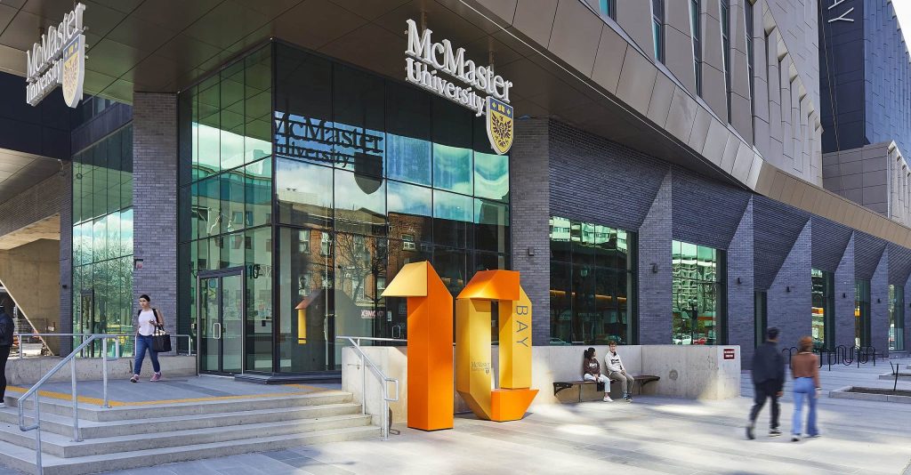
Consistent building names and clear maps are the base. If a building is labeled one way online, another way on a map, and a third way on the door, people will still get lost. Signs that mark buildings and rooms, paired with directional signage across quads and paths, keep everyone moving.
Airports and Transit Environments
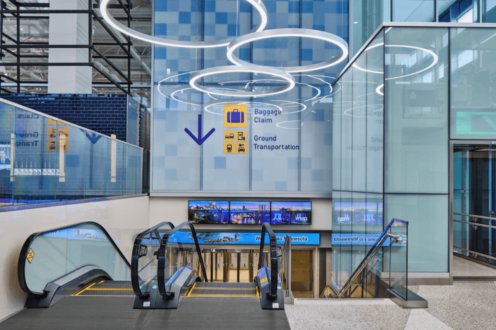
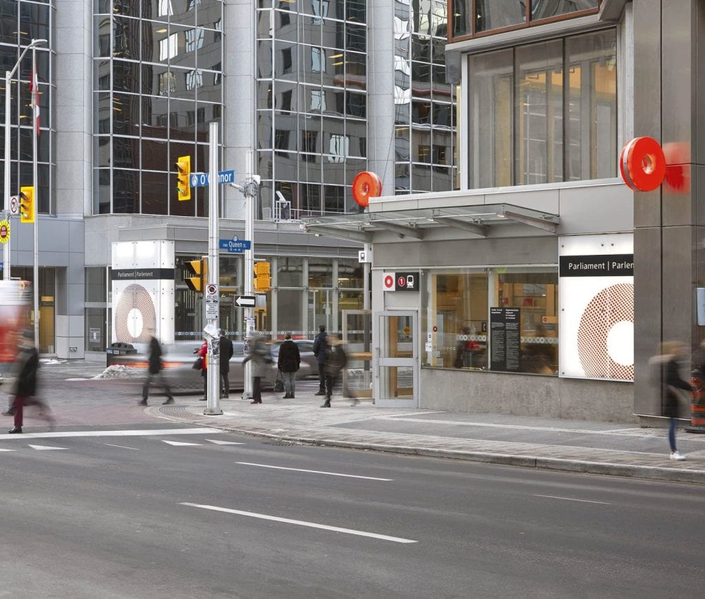
Airports and transit hubs are high-pressure spaces where people watch the clock. Airport directional signage carries most of the weight, guiding travelers from the curb to check-in, through security, and to the gate. Overhead signs at each junction, clear terminal and gate labels, and steady visual cues keep large crowds flowing.
Because schedules and gates change, digital displays play a big role. They update in real time so travelers always see current information. In these settings, small gaps in the signage lead to big problems, so continuity from one sign to the next is everything.
Offices, Stores, and Industrial Sites
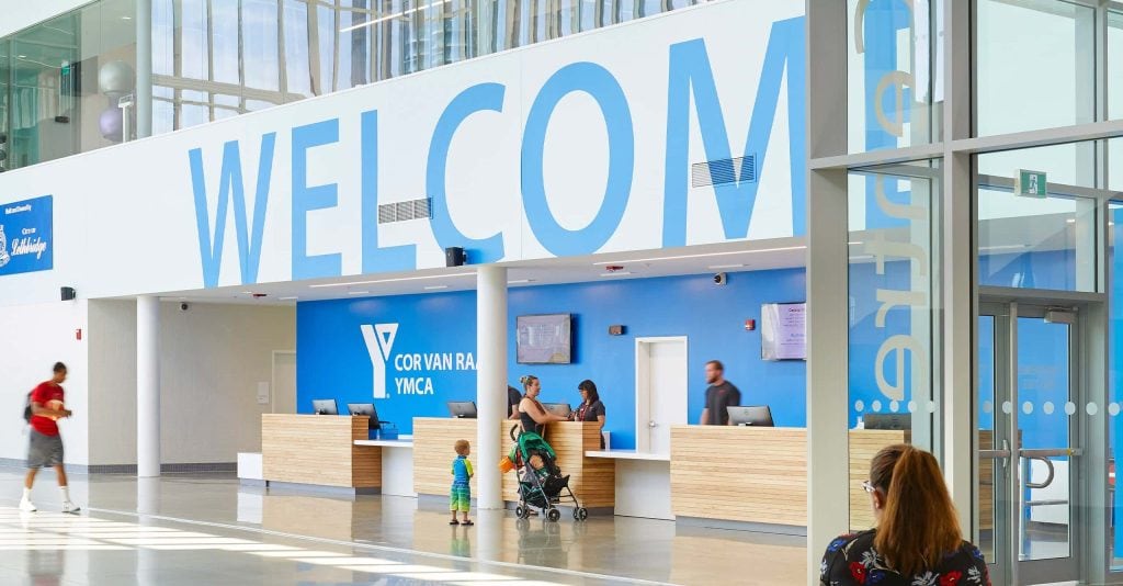
Workplaces balance two audiences. Regular staff know the building, while visitors do not. Clear room names, floor plans, and simple directories help guests find their way without slowing employees down. Retail spaces focus on flow and on messages at the point where people decide what to do next. Industrial sites lean more on regulatory and safety signage, along with clear routes for both people and vehicles. The four core types stay the same, but the emphasis shifts with the setting.
Stadiums, Parks, and Public Venues
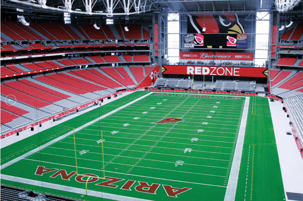
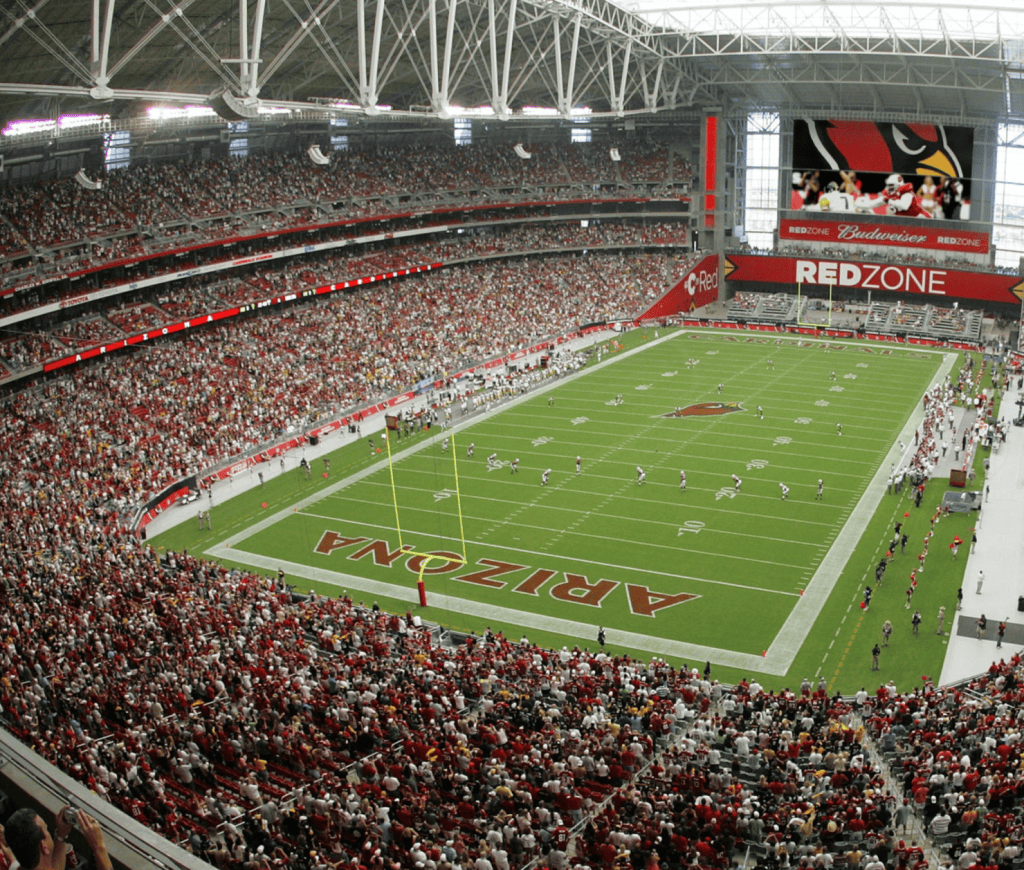
Large venues handle big crowds and high energy. Signs need to be bold, easy to read from a distance, and built to move a lot of people at once, whether that means finding a seat in an arena or a trail in a park. Safety and regulatory signage matter here too, keeping entry, exit, and movement orderly. At the same time, these spaces are a chance to reflect the character of the place, so the walk through the venue becomes part of the experience.
What a Well-Built Wayfinding Signage System Delivers
A clear wayfinding system is not just a convenience. It changes how people feel about a place and how well that place runs. Here is what a strong system gives you.
Calmer, less anxious visitors. When people know where to go, they relax. A clear system removes the worry that comes with feeling lost, so visitors can focus on why they came.
Faster routes and fewer wrong turns. Good signs point people along the most direct path. That saves time, cuts down on backtracking, and keeps foot traffic from bunching up in the wrong places.
A better first impression. The way people navigate shapes how they feel about the whole space. A smooth arrival signals to visitors that the place is well-run and that their time is respected.
Safer movement in emergencies. Clear exit signs and safety notices matter most when something goes wrong. A system that guides people to exits and safe areas supports their well-being when it counts.
Access for everyone. Thoughtful signage helps people with different abilities move through a space with dignity, and the US Access Board’s signage guidance sets out what that takes.
Stronger brand presence. Signs carry the look and feel of an organization. Consistent colors, type, and materials carry the identity and make a space feel considered rather than pieced together.
Smarter use of every square foot. Wayfinding can guide people through quieter areas, spread out foot traffic, and help a building function as intended. That supports better use of the whole space.
The Elements of Wayfinding Signage That Actually Guide People
Some signage systems look fine but still leave people confused. The difference is rarely the number of signs. It comes down to a few core elements that make a system easy to follow.
A Consistent Visual Language
People learn a system quickly when it stays the same throughout. The same colors, fonts, symbols, and naming from start to finish let visitors read one sign and know how to read the next. Consistency builds trust, and trust keeps people moving.
Information in Order of Importance
Each sign should lead with what matters most. The main message needs to stand out, with supporting details present but quieter. When everything shouts at once, nothing gets through.
Signs Where Decisions Happen
A sign only helps if it appears at the moment a person needs it. That means placing signage at each junction, elevator, or split where someone has to choose, and doing it before the choice, not after.
Readable Type, Strong Contrast, Clear Icons
A sign has to be readable at a glance, from a distance, and in the real lighting of the space. That calls for clear type, strong contrast between the text and the background, and simple symbols that make sense across languages. If a sign takes effort to read, it is not doing its job.
Where Wayfinding Signage Tends to Fail
Wayfinding usually breaks down as a system, not as a single bad sign. A few common problems show up again and again, and more signs rarely fix them.
Too Many Signs Fighting for Attention
When too many signs crowd one spot, they fight for attention, and the message that matters gets lost. This usually builds up over time, as people add new signs without a plan. In commercial spaces like malls and airports, wayfinding also competes with advertising, retail displays, and promotional signs, and the directions are usually the ones that get drowned out. The fix is to clear out the extras, give wayfinding its own visual space, and keep it separate from the marketing around it.
Names That Change From Sign to Sign
If a destination is called one thing on the website, another on a directory, and a third on the door, people stop trusting the signs. Use consistent names across every touchpoint, from the first email to the final room, to keep the system honest.
Hidden Signs and Blocked Views
A sign helps only if people can see it. Doors, columns, plants, and furniture can hide a sign or block the sightline to it. A map that is hard to orient from where a person stands causes the same trouble. Good placement and clear views matter as much as the design itself.
Planning and Reviewing Your Signage System
A short, honest review shows you which parts of a system work and which parts leave people stuck. You can start without any special tools. Just walk the space the way a first-time visitor would.
A Quick Way to Decide What You Need
Before you add or change anything, figure out what the space actually calls for.
Two questions do most of the work:
Does the destination stay put, or does it change often? A fixed layout can rely on permanent signs, while a space with shifting gates or rotating events needs room for digital updates.
Who are your visitors? Regulars learn a building fast. First-timers need help at every step. Those answers tell you how much signage you need and where to spend the effort.
Walking the Route the Way a Visitor Would
The most useful review follows the path a visitor takes, not the layout on a floor plan. Start at the front door. Is it clear you have arrived in the right place?
Look for a map, a desk, or a landmark to get your bearings. At each junction, check whether the next move is obvious before you reach it. Along longer stretches, notice whether there is enough to keep you sure you are still going the right way. After stairs, elevators, or big turns, look for a sign that confirms it. Then check that the destination, the exits, and the way back are all easy to find. Anywhere you hesitate, a real visitor will hesitate too.
How Entro Helps Create Wayfinding Signage That Works
The difference between signage that guides people and signage that confuses them comes down to how it was designed. The systems that work are built around how people actually move, and they are tested before anything goes on the wall. That is the work we do at Entro.
We have specialized in placemaking and wayfinding since 1990, with a team of more than 90 people across Toronto, New York, Calgary, and Vancouver. Here is how we help:
We design from real behavior, not guesswork. We study how people move using pedestrian flow modeling, eye-tracking, space syntax analysis, and virtual reality testing, so signs end up where people actually need them.
We test before anything is built. On the Memphis International Airport project, we used virtual reality to walk the space and check sign placement while changes were still easy to make.
We follow a clear five-step process. From research and discovery through to implementation and follow-up, our research and design teams work side by side the whole way.
We design for everyone. Accessibility is a starting point, not a box to check, so every visitor can find their way with confidence.
Ready to build a space people can navigate with confidence?Talk to our wayfinding team and let’s design a system that works from day one.
Bottom Line
Wayfinding signage works best when you think of it as a system rather than a set of separate signs. The four types of wayfinding signage – directional, identification, informational, and regulatory, each play a part, and they work even better when the layout, the digital tools, and the people around them all carry the same clear message.
If a space feels confusing, it usually means the wayfinding needs a proper plan, not just another sign on the wall. Done well, wayfinding does the guiding for you. It follows how people move, meets them at each decision, and makes even a complex space feel simple to get through.
FAQs About Wayfinding Signage
What are the main types of wayfinding signage?
The main types of wayfinding signage are directional, identification, informational, and regulatory. Directional signs point people toward a destination, identification signs confirm arrival and label places, informational signs share useful details like maps and hours, and regulatory signs communicate rules and safety information. Each type does a different job, and a strong system uses all four together.
How is wayfinding different from signage?
Signage is the physical part, the actual signs, arrows, and symbols on the wall. Wayfinding is the wider plan for how people find their way, and it includes the signs along with the layout, sightlines, landmarks, and choices a person makes along a route. Good signage is one tool inside a larger wayfinding plan.
How do you build a signage system that actually works?
Start by studying how people move through your space and where they tend to get lost. Keep names, colors, and symbols consistent from start to finish. Place signs at decision points, before people have to choose. Make sure the type is readable, and the contrast is strong. Then walk the route the way a visitor would, and keep refining the parts where people slow down or ask for help.
Do small spaces need wayfinding signage too?
Yes. Even a one-floor office needs signs at the door, in reception, in restrooms, and in key rooms. A few clear ones save visitors from having to wander or ask. Simpler than an airport, same goal: help people find their way.
How long does a wayfinding project take?
Usually three to six months, from research to installation. It depends on the size of the space, fabrication time, and site conditions. A hospital campus takes longer than a single office. Starting early keeps it on track.