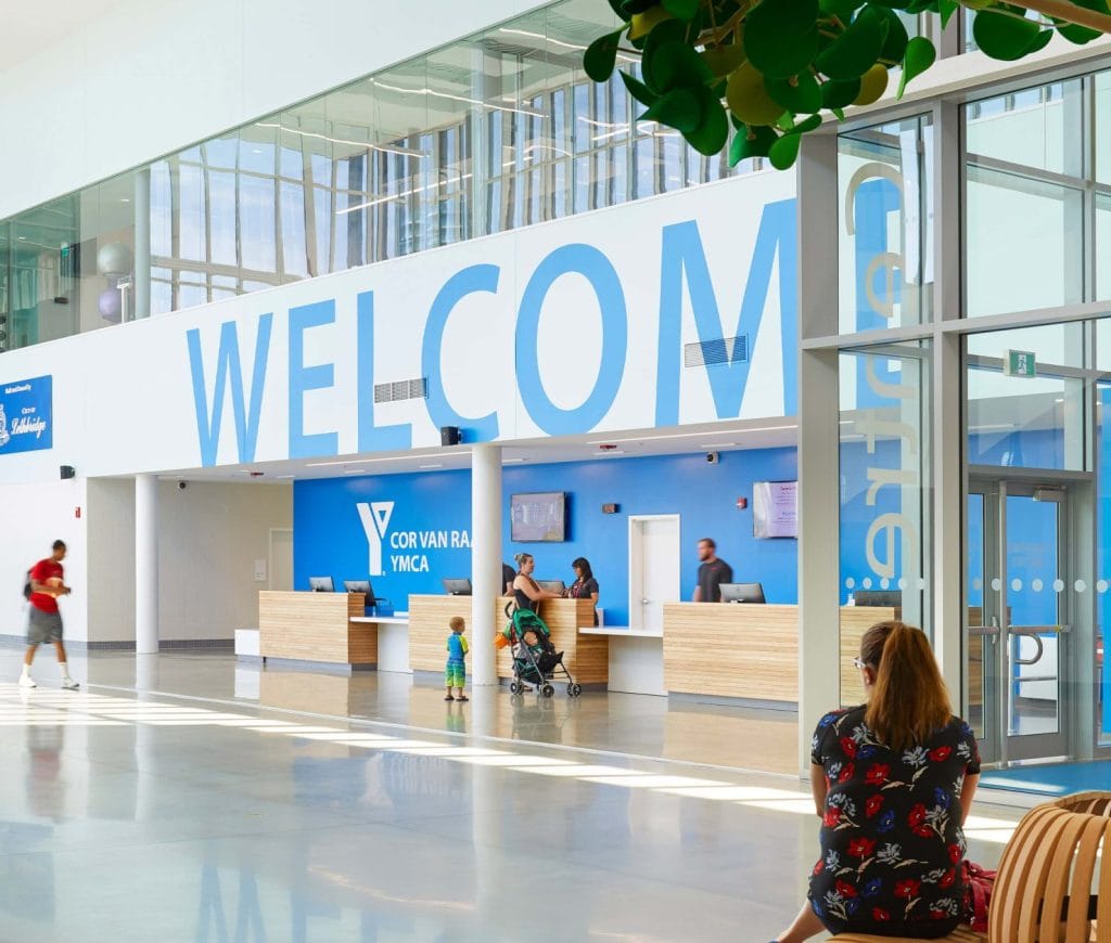
Most people notice wayfinding only when it fails: the wrong turn, the backtrack, and the walk back to the front desk to ask. A wayfinding site audit is how you catch those failures before your visitors do. It is a structured review of how well a building helps people find their way, from the moment they arrive to the door they are looking for, looking past the signs to the layout, sight lines, lighting, and naming that shape the whole journey.
At Entro, we have spent more than three decades running wayfinding site audits for some of the hardest buildings to read: airports, hospitals, transit networks, and museums. This guide opens up that method. We are sharing the same checklist and the same judgment calls that we use on our own projects, so you can see how a proper audit is done and run one yourself.
What Is a Wayfinding Site Audit?
Before you run one, it helps to be clear on what a wayfinding site audit is. Two distinctions matter most: how it differs from a simple sign survey and why it reaches past the signs into the shape of the building itself.
Audit vs. sign survey, and what an audit really measures
People often treat a wayfinding site audit and a sign survey as the same thing. They are not. A sign survey counts what exists: where each sign sits, what type it is, and what condition it is in. That is useful but limited. It tells you what you have, not whether it works.
An audit asks a harder question. Does the space help a first-time visitor get where they are going, with confidence and without stress? To answer that, the audit looks at the whole system: the approach from outside, the entrance, the first choice inside the door, the long walk down a corridor, and the moment someone reaches a junction and has to pick a direction. A sign survey is one input to an audit. The audit adds the judgment that turns a list of signs into an understanding of why people get lost.
Beyond signage: assessing site legibility
Good wayfinding starts long before anyone reads a sign. A building that is easy to read, with a clear layout, open sight lines, and memorable landmarks, does much of the work on its own. Architects call this legibility: how well the shape of a place explains itself.
An audit tests that legibility:
Can people see the reception desk when they walk in?
Does the building’s form lead them toward the lifts without a single arrow?
Are there landmarks, a staircase, a piece of art, a courtyard, that people can hold in mind and steer by?
Signs matter, and this guide gives them close attention. But the best sign cannot rescue a layout that fights the people inside it, which is why an audit weighs architecture, light, and layout alongside the signs.
Why It Matters and When to Do It
An audit costs time and attention, so it is worth being clear on the payoff and the timing. The first question is what a confusing building is quietly costing you; the second is when to act on it.
The business case: cost, experience, safety, brand
A confusing building is expensive, and most of the cost is hidden. Staff stop their own work to walk lost visitors to the right door.
Appointments start late or get missed. People arrive tense before a meeting, a class, or a medical test has even begun.
In healthcare, the stakes are higher still.Research indexed by the U.S. National Library of Medicine has measured how poor wayfinding in hospitals wastes staff time and adds to patient stress, with people who cannot find their way reporting more anxiety and, in some studies, measurable rises in blood pressure and heart rate. When a place is hard to read, the people who suffer most are often those least able to cope with the added strain: someone unwell, someone anxious, or someone visiting for the first time.
There is a brand cost too. The walk from the car park to the front desk is a first impression, and a muddled one lingers. Safety sits underneath all of it: a corridor that is unclear on an ordinary Tuesday is far worse in an emergency, when people have to get out fast and under pressure.
The right triggers: new builds, refurbishments, complaints, and periodic reviews
An audit should not be treated as a one-time task. Some moments make it especially important. For example, a new building should be reviewed three to six months after people move in, when real movement patterns begin to appear, and issues that were not obvious on the plans become easier to spot. Before a refurbishment or rebrand, an audit can also show what is working, what needs improvement, and where the budget will have the greatest impact.
Change is another trigger. Departments move, teams merge, and the old signs quietly start misinforming people. A run of complaints about people getting lost or missing appointments is a signal worth acting on. And even with no obvious problem, a review every three to five years keeps a system honest, catching the slow drift of faded signs, taped-up notices, and names that no longer match.
Preparing for the Audit
A good audit is mostly won before anyone starts walking. Get the right people and the right paperwork in place first, and the day on site becomes a matter of looking closely rather than scrambling to catch up.
The team, scope, and target visitors (“fresh eyes”)
The people who know a building best are not always the best people to audit it. They are so familiar with the space that they may no longer notice unclear signs or confusing routes. Staff can often find their way without thinking, which makes it easy to overlook problems that would be obvious to a first-time visitor.
The best solution is to bring in a fresh perspective. A strong audit team usually includes someone with wayfinding or design experience, who can assess how clear and readable the signs are, alongside someone who represents the people the space is meant to serve. Ideally, that person should be unfamiliar with the building.
A facilities manager can also provide useful context about recent changes and future plans. Before the audit begins, agree on the scope, whether that means reviewing the entire site or focusing on one problem area. It also helps to identify the two or three main user groups you need to support, such as patients, students, fans, or first-time visitors. This keeps the audit focused on real journeys and real needs.
Gathering plans, feedback, and planning the route
Preparation makes the day itself count. Before you set foot on site, pull together the records that let you check what you see against what was meant to be there:
Current floor plans, since you will mark findings on them as you go.
The existing sign schedule, if one exists, so you can compare what was specified against what is on the walls.
Comments from staff and visitors about where people struggle, which points you to the trouble spots before you start.
A current list of departments and room names, so you can catch signs that no longer match.
Then plan the route. Cover every public area: entrances, lift lobbies, stairwells, and every point where a person has to make a choice. On a large site, split the building into zones and give each one to a member of the team. A rough rule of thumb is to allow about an hour for every thousand square meters if you want a thorough pass.
How to Run the Audit: The Walkthrough
With the prep done, the audit itself is a walk, taken slowly and in character. Two things carry it: seeing the building as a stranger and recording what you find so it still makes sense weeks later.
Assess the full journey as a first-time visitor
The heart of the audit is a walk, taken in character. Start where a real visitor starts, at the edge of the site, the car park, the transit stop, or the pavement, not at your usual staff door. Then follow the whole journey to a specific destination, a named clinic, a lecture theatre, or a particular office, exactly as a stranger would.
Move at their pace. Notice where you slow down, where you hesitate, and where you would have to ask someone. Those moments of doubt are the real findings. Then make the return trip, since getting out is often harder than getting in, and the signs that guided you one way may vanish on the way back.
Capture the evidence: photos, notes, references
An audit is only as good as its record. Photograph every sign you assess, and its setting too: the angle you saw it from, what stood near it, and anything blocking the view. Give each photo a name that ties it to a spot on the floor plan and to the checklist item. Write observations as plain, factual notes. The aim is a record clear enough that someone who never walked the building could act on it months later.
The Wayfinding Site Audit Checklist
This is the working heart of the audit. The categories below gather, in one place, what the strongest guidance across the field checks for. Run through each one as you walk, and score every item (the next section explains how).
Arrival and orientation
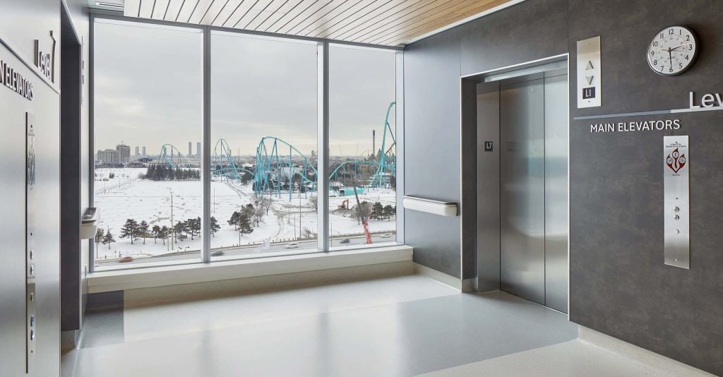
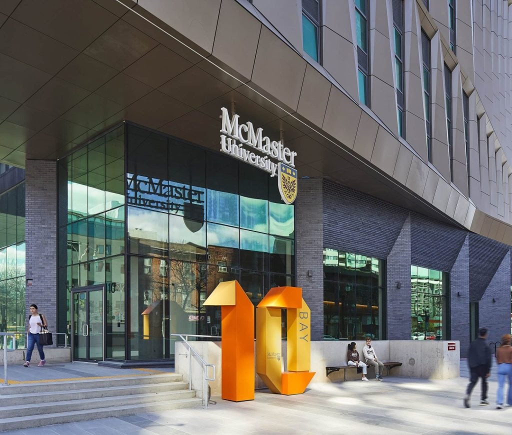
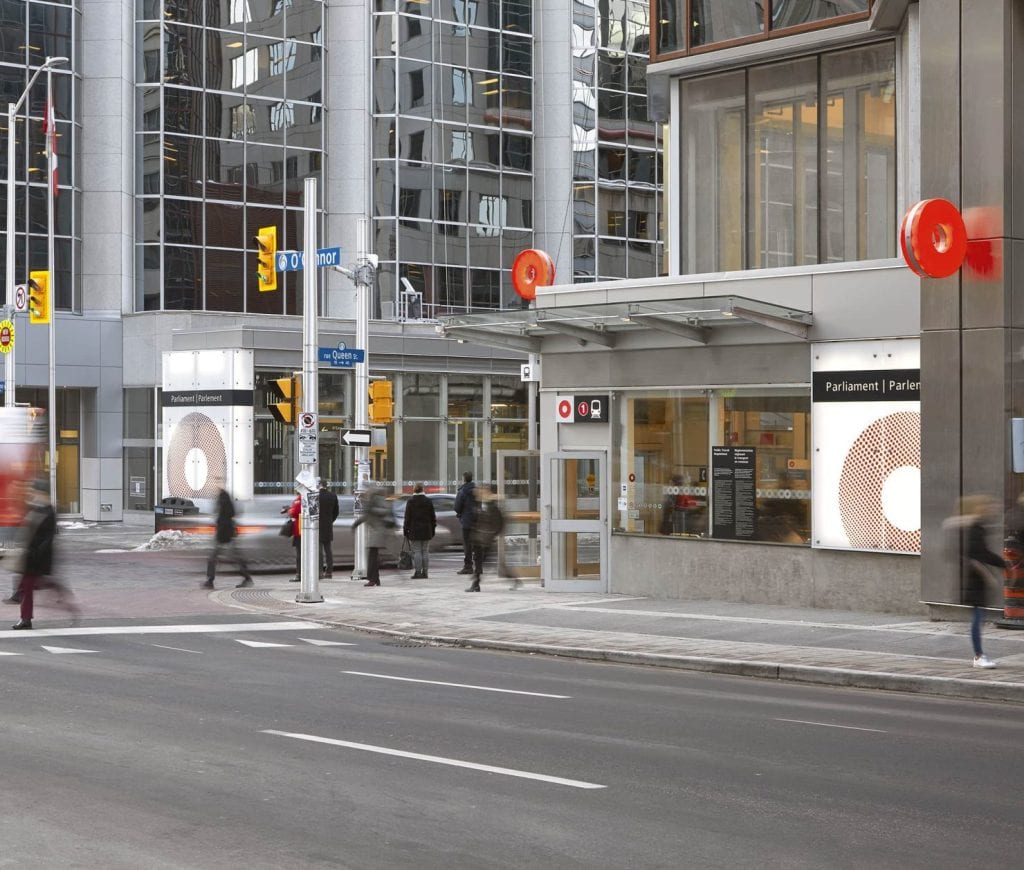
Can people find the building and the right entrance from the road, car park, transit stops, and pedestrian paths?
Is each entrance named and easy to tell apart (“Main Entrance,” “Entrance B”)?
Inside, can a first-time visitor tell within seconds where they are, what the place is, and where to get help?
Is a map or directory in sight of the door, and is the current floor level marked?
Do landmarks, art, or building features confirm people have arrived in the right place?
Decision points and route reassurance
Have you found every point where a person must choose between two or more routes?
Is there a clear directional sign at each one, showing only what people need there, not the whole building?
Are arrows consistent and pointed correctly for the routes they describe?
Can each sign be seen from the approach, with no door, column, or plant in the way?
Along long corridors, do reassurance signs and logically ordered room numbers confirm people are still on the right path?
Destination identification
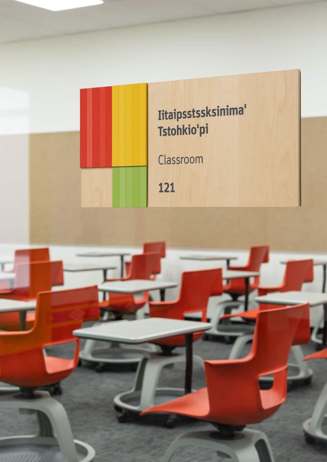
Does every room and space carry a clear identification sign?
Does its name match the directional signs, directories, website, and any letters or emails people receive?
Are identification signs mounted consistently by every door, same side, same height?
Can a sign be read in time to stop at the right door while walking past?
Sign condition, legibility, and lighting
Is each sign clean, whole, firmly fixed, and free of fading or damage?
Is the information still correct after any moves, renames, or organizational changes?
Is the type large and clear enough for the distance people read it from?
Is there strong contrast between text and background, with a non-glare finish?
Can people read the signs clearly at any time of day, without glare? Check that furniture, plants, posters, or other objects are not blocking them.
Information hierarchy, maps, and naming
Do the main destinations (reception, lifts, exits) stand out clearly from the minor ones?
If you-are-here maps are used, are they turned to match the way the reader faces, so no one has to rotate the map in their head?
Do directories list everything the public needs, and is the same wording used across signs, maps, directories, and screens?
Is there a clear naming theme, with names and symbols people from many backgrounds can read, using pictograms or a second language where that helps?
Accessibility and universal design
Accessibility is not a box to tick at the end. It shapes whether a space works for everyone who walks in.
Are tactile signs with raised, uppercase sans-serif characters and Grade 2 Braille provided where the standards require, with strong contrast and a non-glare finish?
Are they mounted at the right height? Underthe U.S. ADA Standards, Section 703, tactile characters sit between 48 and 60 inches (1220 to 1525 mm) above the floor, measured to the baselines of the characters, on the latch side of the door.
Can every signed route be used by someone in a wheelchair, and are step-free routes marked where they differ from the main one?
Are audible or other supports provided where people who are blind or have low vision need them, with clear floor space in front of maps and directories?
Standards differ by country. In the United States,the ADA Standards for Accessible Design govern signage. In Canada, the Accessibility for Ontarians with Disabilities Act and its public-spaces standard apply. Internationally, ISO 21542 covers accessibility of the built environment. Meeting the letter of these rules is the floor, not the ceiling. The aim is a place where everyone, across the full range of ability, can find their way and feel they belong in it.
Emergency egress and ad hoc signage
Are exit signs lit, correctly placed, and visible from every point on the escape route, in line with life-safety codes such asNFPA 101 and local building codes?
From any spot in the building, is the way out obvious from the emergency signs alone, with assembly points marked and easy to find from outside?
How many taped-up, printed, or handwritten signs are there, and do any contradict the permanent ones? A cluster of temporary signs almost always confesses that the permanent system has failed at that spot.
Scoring and Measuring the Audit
Findings are only as useful as they are comparable. Scoring turns loose notes into ranked, trackable data, and watching real people move shows you what the scores alone cannot.
A five-point scoring framework
Score
Rating
What it means
5
Excellent
Meets or beats good practice. No action needed.
4
Good
Minor issues, low priority.
3
Adequate
Works, but with real flaws. Medium priority.
2
Poor
Causes regular failures. High priority.
1
Severe
Absent or dangerous. Fix now.
Notes alone are hard to compare and easy to argue with. A simple score turns what you saw into something you can rank, track, and defend. A five-point scale works well: 5 for excellent, meeting or beating good practice; 4 for good, with minor issues; 3 for adequate but flawed; 2 for poor, causing regular failures; and 1 for severe, absent or dangerous and needing action now.
Score every checklist item and record the score next to the note that explains it. Weight the categories by how much they matter to finding your way: arrival, decision points, and accessibility usually carry more weight than, say, the condition of a single back-office sign. Average the scores, with those weights, for an overall figure you can compare between floors, between buildings, or against the same building a year later.
Measuring what works: wayfinding trials and behavioral observation
Scores capture expert judgment. To see what really happens, watch real people move. This is where an audit earns its keep and where a design-led approach goes well past a simple sign count.
Run task-based trials. Give someone a destination they do not know, then watch how they get there.
Record what happens. Track how long it takes, how many wrong turns they make, where they stop, and where they double back.
Watch for shared hesitation. A spot that makes several people pause is telling you something a checklist might miss.
Talk to the front desk. Short conversations with staff and visitors fill in the rest, since they usually know exactly where people get stuck.
Go further where it counts. Firms that specialize in the field add eye-tracking to see where people look and virtual reality to test sign placement before anything is built.
The tools vary. The point does not: the space is judged by how people behave in it, not by how it looks on paper.
From Findings to Report
A walk full of sharp observations is wasted if no one can act on it. This part covers how to record what you found, how to rank it, and how to shape a report that gets read and used.
Documenting findings: photos, floor plans, data
The care you put into recording findings decides whether anyone can act on them. Keep the photographs organized and named. Mark every assessed spot on a floor plan with a reference number, and color-code it by score: red for severe, amber for poor, and green for good. An annotated plan gives findings the one thing a page of text cannot: a sense of place. Whether you work on paper or in software, capture the same fields for each item: location, checklist point, score, a plain note, a photo reference, the fix you suggest, and how urgent it is.
Prioritizing fixes: impact vs. effort
You cannot fix everything at once, so sort the findings by two questions:
How much does this problem hurt?
How hard is it to put it right?
High-impact and low-effort are quick wins, done straight away: replacing a damaged sign, clearing an obstruction, or correcting wrong wording. High-impact and high-effort are larger projects to plan and budget for, such as signing every unmarked decision point or rebuilding a directory. Low-effort items fold into routine upkeep, and low-impact, high-effort ones get noted and parked unless money frees up.
The audit report structure
A report has to speak to two readers at once: the senior one who wants the headline and the facilities team who will do the work. Open with a one-page summary that names the overall condition, the number of severe issues, and the handful of things to fix first. Follow the method so the findings carry weight and can be repeated later. Show the scores, ideally with a simple chart across categories. Then go area by area, each with its annotated plan and a table of findings, before pulling everything into a single list of recommendations ordered by priority. Keep the raw data and full photographs in an appendix.
Common Findings (and Fixes)
Buildings differ, but the ways they fail rarely do. The same handful of problems turn up again and again, and each has a clear, low-cost fix once you know to look for it.
Missing signs, inconsistent naming, and obstructions
Some problems show up in almost every building. The most common is the simplest: no sign at the point where people have to choose. Buildings tend to sign their front doors well, then fall silent at the intersections inside, which is exactly where people get lost. The fix is to walk the real routes, find the unmarked choices, and sign them.
Another common problem is inconsistent naming. A room may have one name on the sign, another in the directory, and a third in the appointment letter. Even small differences can make people question whether they are heading to the right place. Choose one clear name for each location and use it everywhere.
Obstructions are another easy-to-miss issue. A sign that was perfectly visible when it was installed may now be hidden behind a plant, noticeboard, or coffee machine. These problems are usually quick and inexpensive to fix once they have been identified, which is exactly why walking the space matters.
Misoriented maps, accessibility gaps, and ad hoc build-up
You-are-here maps cause more trouble than they should. When a map is not turned to match the way the reader faces, people have to flip it in their minds, and many get it wrong. Align the map with the view, and mark the reader’s position plainly. Accessibility gaps are common too: tactile signs missing, mounted at the wrong height, or fitted to some rooms and not others. These need to be brought up to standard as a matter of course.
The last pattern is the tell-tale one: a slow build-up of taped-up, printed, and handwritten signs. Each was added to patch a gap the permanent system left open. Read together, they map every place the design is failing and make a good prompt for what to fix first.
Sector-Specific Considerations
The method in this guide holds anywhere, but every setting bends it a little. What people need from a hospital is not what they need in an airport, a campus, or a museum.
Healthcare, airports, and transit
The principles are constant, but the pressures change with the setting. In healthcare, people arrive anxious, often unwell, and sometimes in pain, and the buildings are among the most complex there are. Small failures land hard here, which is why hospital wayfinding rewards plain language, calm and consistent signs, and routes planned around a worried first-time visitor rather than a member of staff who knows every shortcut.
Airports and transit wayfinding bring their own demands: huge distances, crowds, tight timings, and people who may not share a common language and are often carrying luggage or shepherding children. Signs have to be read at a distance and at a glance; choices have to be timed to where people stand, and a network that spans several operators has to feel like one place even when many organizations run it.
Education, civic, museums, and mixed-use
Campuses, civic buildings, museums, and mixed-use sites each ask something different.
Campus wayfinding signage serves people who learn a site over years and visitors who see it once, so it balances a durable system with clear help for newcomers.
Civic wayfinding signage carries a duty to be readable and welcoming to every member of the public.
Museum wayfinding signage shapes a route as part of the visit, guiding people through a story while leaving room to wander.
Mixed-use wayfinding signage juggles offices, shops, homes, and parking under one roof, where clear naming and zones keep very different visitors from colliding.
In each case, the audit adapts its checklist to the setting while asking the same central question: can people find their way with ease and confidence?
DIY vs. Professional Audit
You can run an audit in-house or bring in a specialist, and both can work. What matters is understanding what each approach catches, what it tends to miss, and what it costs.
What in-house teams miss vs. the expert perspective
An in-house team brings something no outsider can match: they know the building inside out, they are on hand, and they cost little to put to work. That same closeness is the catch. Because staff know every route by heart, they rarely see the spots where a newcomer stalls.
An independent reviewer brings the one thing an in-house team cannot manufacture: the honest confusion of a first-time visitor, plus a trained eye for why it happens, a scoring method, and current knowledge of accessibility law.
A capable in-house team can still run a real audit with the checklist in this guide, as long as at least one person walks the building as a true stranger. For a complex site, an outside expert usually finds more, faster.
What does an audit cost?
Cost tracks scope. A single building of moderate size might take a day or two on site and a week or two to write up; a hospital or a campus takes longer, with more people and more zones to cover. There is no single price, because no two sites are alike, and much depends on how deep you go. The better way to weigh it is against the cost of doing nothing: the staff hours lost to giving directions, the missed appointments, and the poor first impressions that quietly add up.
From Audit to Wayfinding Strategy
An audit is a diagnosis, not a cure. Its real worth shows in what happens next.
Turn findings into a brief. Feed the results straight into a design brief that fixes the underlying problems rather than papering over them with more signs.
Start with the quick wins. Clear the easy, high-impact fixes first to build momentum.
Plan the bigger projects properly. Give the larger pieces the real budget and design behind them.
Build in upkeep. Set a simple routine for updating signs when rooms change and pulling down temporary notices once they have done their job, so the system you paid to improve does not quietly drift back.
Handled this way, a site audit becomes the first step in a clear plan, not a report that gathers dust.
From Audit to Design, the Entro Way
A wayfinding site audit takes a vague complaint, “people get lost here,” and turns it into something you can point at and fix. It looks past the signs to the whole experience of arriving and finding your way, scores what it finds, and gives you a plan you can act on, from quick wins to the bigger jobs. Done well, the payoff is real: less staff time lost to giving directions, calmer visitors, signs that meet the standards protecting people most at risk, and a building that feels looked-after from the car park to the last door.
The signs are the easy part. The harder question is whether the shape of the building, the light, and the layout are helping people or quietly working against them, and that is the question we walk into answering at Entro.
This guide gives you a solid audit you can run yourself. What we bring on top is depth: we study how people move with flow modeling and eye-tracking, test signs in virtual reality before anything is built, and draw on three decades of work across airports, offices, hospitals, transit networks, parks, museums, and sports venues. So the audit does not just catalog what is wrong; it leads straight into a design that fixes it. If your building is harder to read than it should be, reach out to the professional team at Entro, and we will show you what a proper site audit turns up.
Wayfinding Site Audit FAQs
How long does a wayfinding site audit take, and what does it cost?
A moderate building takes one to two days on site and a week or two to write up; hospitals and campuses take longer. Cost tracks size and depth. Weigh it against what a confusing building already costs you in lost staff time and missed appointments.
Who should conduct it, and how is it different from a sign survey?
A specialist brings method and current knowledge of accessibility law, but a capable in-house team can do a solid job with a good checklist, as long as one person walks the building as a first-time visitor. A sign survey lists the signs you have; an audit explains why people get lost.
How often should it be repeated, and what standards apply?
Every three to five years, and sooner after a refurbishment, rebrand, or run of complaints. Audit new buildings three to six months after people move in. Signage accessibility follows the ADA Standards (Section 703) in the US, the AODA in Canada, and ISO 21542 internationally, with exit signs under codes like NFPA 101.
What is the first sign my building needs an audit?
Watch the front desk. When staff keep pointing people to the same places, or you hear about missed appointments and wrong turns, the building is telling you its wayfinding has stopped working.
Will an audit just tell us to buy more signs?
Rarely. More often the fix is fewer signs in better places, clearer names, or a change to layout or lighting. The point is to find the real cause, not add to the clutter.
What makes an Entro audit different from a sign check?
Entro is an experiential design firm, not a sign supplier, so the audit looks at the whole building, not just the signs. It can draw on methods like flow modeling and eye-tracking to see how people move, then point to the fix, which is often layout, naming, or placement rather than more signage.