Designing for Designers
-
Client
Moore College of Art and Design
-
Location
Philadelphia, Pennsylvania
-
Sector
Educational
-
Discipline
Experiential Design, Wayfinding
-
Architect
JacobsWyper Architects
-
Photography
Kat Kendon
-
Awards
Graphic Design USA Graphis Design Annual Silver Award 16th Grand Prix du Design Silver Certification
Being Bold
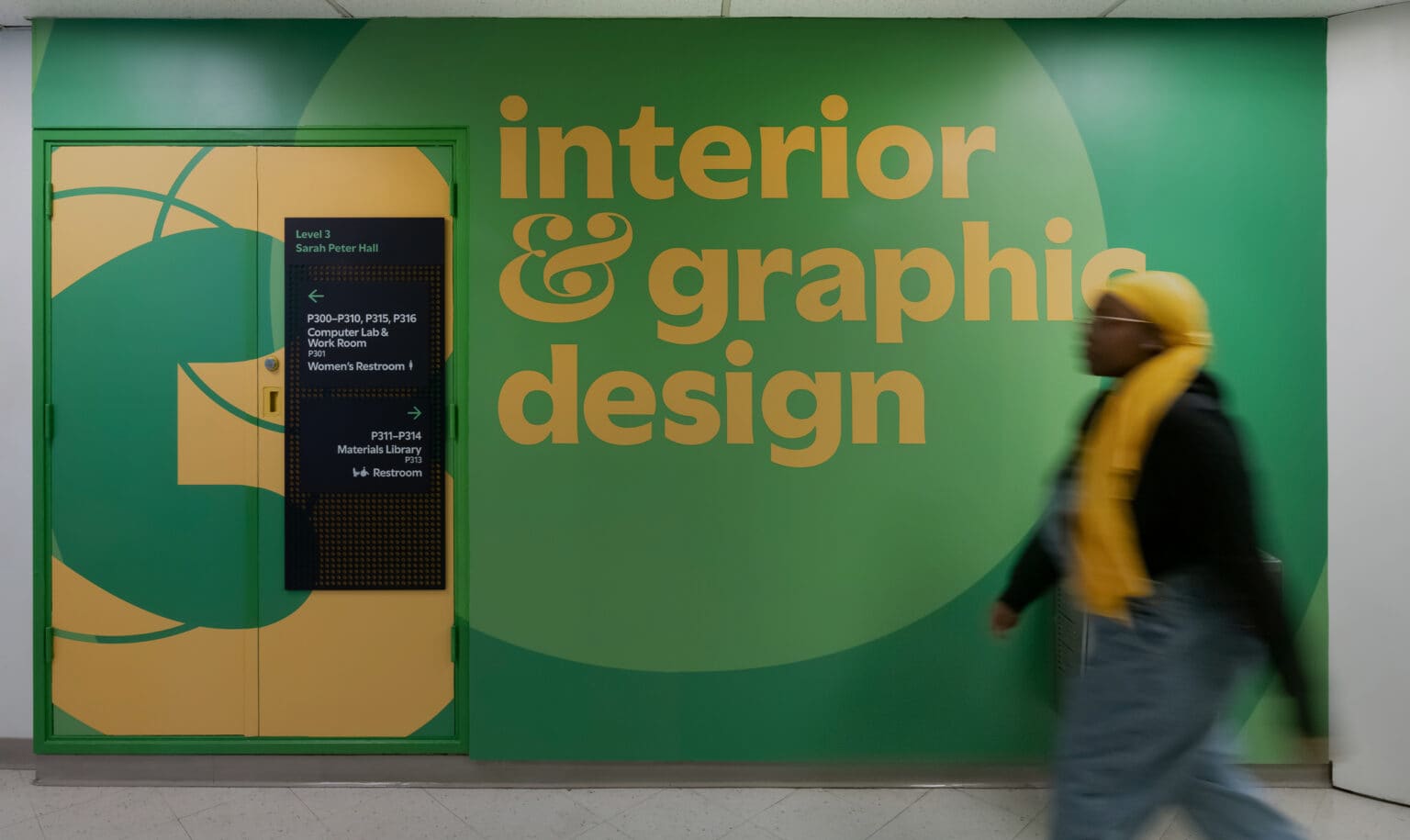
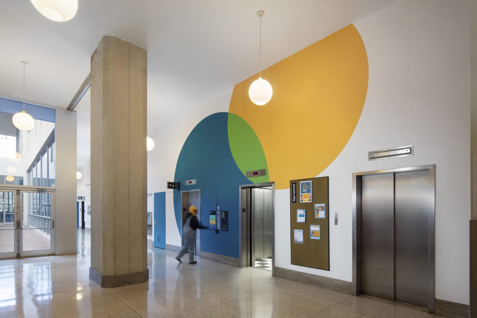
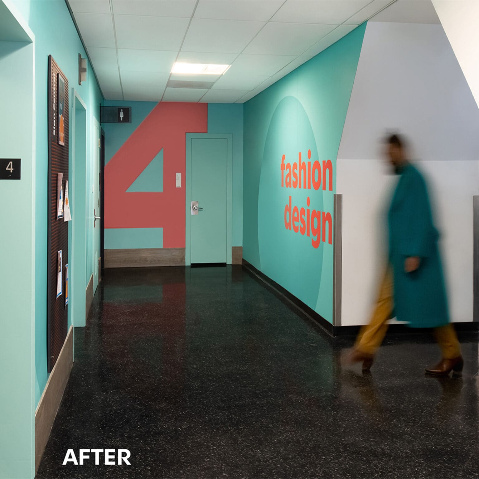
The program is built on bold, energizing graphics paired with brand typography. Shapes and colours are bright and vibrant to create a lively space and make every visitor feel welcome. The double “O” of the logo is the inspiration for the overlapping fields of colour that are present across the program. The overlapping motif represents the merging of disciplines, the power of collaboration, the open-ended nature of art, and the absence of barriers between design and function.
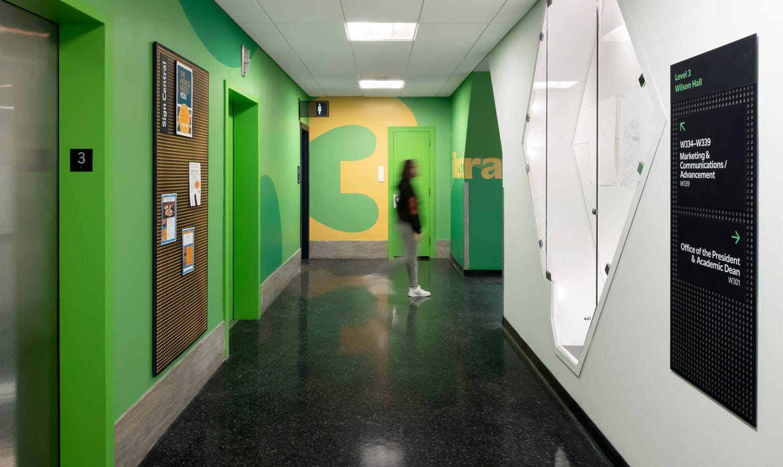
The complements and contrasts prevalent throughout the design language allow for a united visual identity that can also create differentiation. For example, wayfinding directional signage adopts a consistent colour – midnight blue – for easy recognition and optimal contrast of primary information. It also expands on the circle motif, this time as a distinctive perforated pattern punched out of the sign.
Art and Logic
We wanted to create a sense of place and unify what was once a disparate experience for students. Although it may seem counterintuitive, differentiating each area is key to creating continuity. Giving each floor and discipline its own identity creates a sense of entering and exiting a location, keeping wayfinding intuitive and directions easy to understand.
Because the campus is arranged vertically, elevator lobbies are key hubs for circulation and the primary entry point of every discipline. Building on Moore’s brand colour palette, we selected bold colour combinations to both highlight and visually link floor plates across adjoining buildings.
Moore’s 2020 rebrand was a major change in how the College presents itself, and our wayfinding and signage overhaul was incredibly important as an institutional initiative. Our enhanced wayfinding and environmental graphics truly resonate with our target student audiences, bring a welcome improvement to overall campus accessibility, and have helped us move fully into the next chapter of Moore’s rich story.
Nicole Steinberg, Chief Marketing and Communications Officer, Moore College of Art & Design
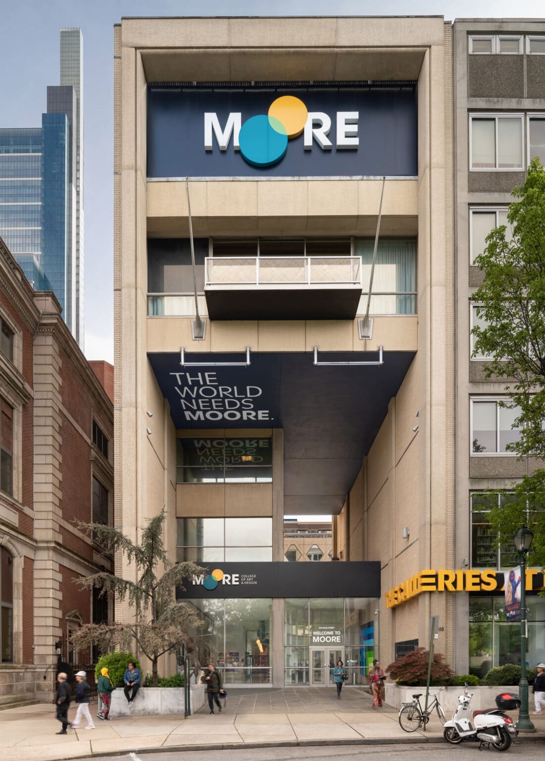
Students and faculty provided design input through interactive workshops. We tapped into the teachers’ expertise, the students’ fresh perspectives and the culture of the institution as a whole. Moore incorporated the project into classes, giving students the opportunity to learn about the new field of experiential design as they created murals for the building’s exterior.
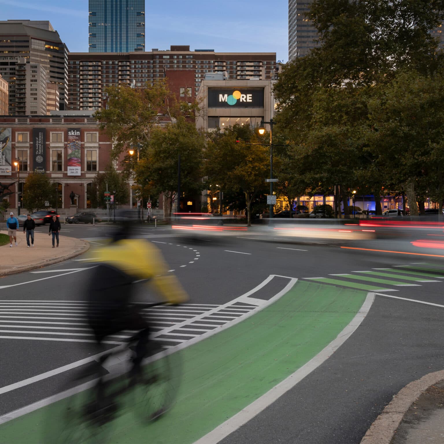
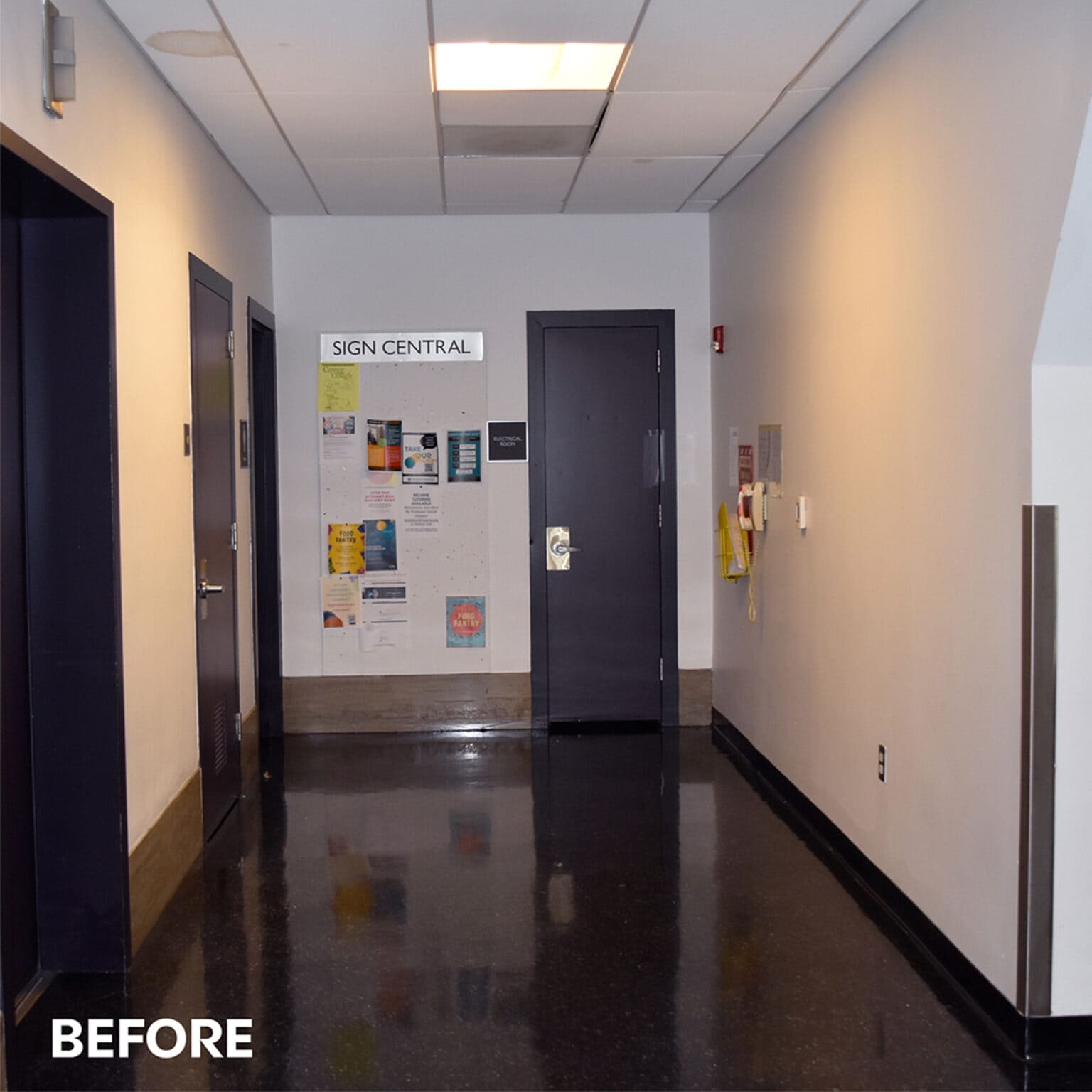
Students and faculty are excited by the new look! This project demonstrates the power of experiential graphic design to bring a vibrant new identity to life and revitalize existing campus spaces without the need for costly renovations.
Find out more about Moore College of Art & Design.
