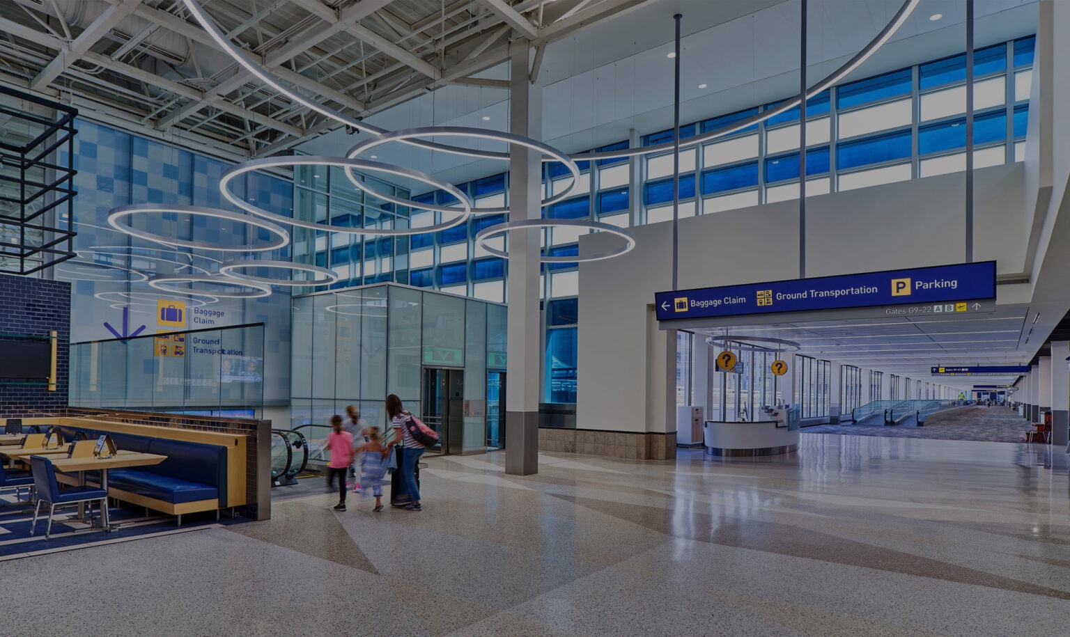
A Major Upgrade Arrives
-
Client
Minneapolis-Saint Paul Metropolitan Airports Commission
-
Location
Minneapolis, Minnesota
-
Sector
Airports
-
Discipline
Wayfinding, Static and Digital
-
Architect
Alliiance
-
Photography
John Magnoski Photography
Easing Traveller Tension with Digital Signage
Arriving at the airport can bring a mix of emotions: excitement, anticipation, and anxiety. While it’s a different experience for everyone, our goal was to help people clearly understand where to go and what to expect. This can reduce tension and start their journey with an increased sense of calm and safety.
To do this, we designed a series of digital signage types, including smart technology that communicates up-to-date information in real time. Digital roadway signs let drivers know what curbside services are available.
Curbside medallions identify accessibility access points and the airline check-in counter closest to a given entrance, so passengers don’t have to carry their luggage further than necessary.
Inside Terminal 1, a sixty-foot digital sign spans the intermodal transit area, informing travellers of the different locations and wait times for the security checkpoints. This helps to facilitate decision-making and avoid unnecessary crowding.
Working closely with the Customer Experience team, we developed surveys to get feedback from airport staff and volunteers. Ground transportation was identified as one of the most challenging destinations for customers to navigate to. Digital signage—and carefully placed messaging— has been crucial in aiding travellers to better understand the options and the most efficient pathways to these services.
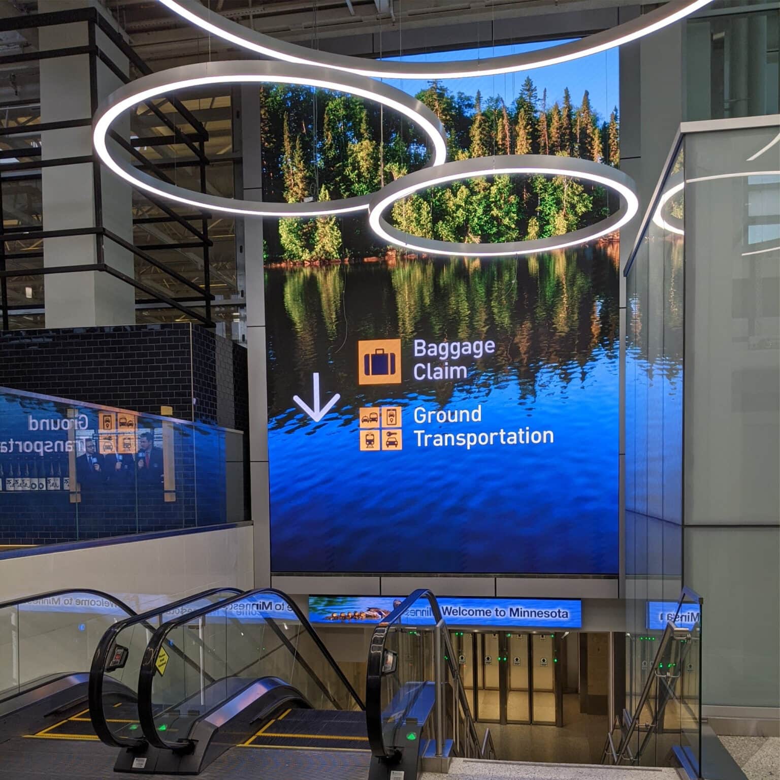
There’s nothing more frustrating than being unsure of where to go with no visual cues to help you find your way. And as designers, we’re just as frustrated when aesthetics are completely cast aside in the name of pure function. We believe that beauty and function can—and should—live together in harmony. A great example of bringing this ethos to life is in the illuminated ceiling installation created by Alliiance that naturally draws people’s eyes to the escalators, which is the primary exit from the arrivals level. Here, people are greeted with a beautiful large-scale digital image along with wayfinding messaging. Airport guests are quickly able to find their way while experiencing a moment of artful inspiration.
Truly Inclusive
As a major transit hub, MSP welcomes a diverse range of guests across a multitude of languages and accessibility needs. This led us to using large, bright pictograms offering universally recognizable symbols and the inclusion of tactile messaging and braille on identification signage and elevator panels. The signage also lets people know that MSP offers free access to Aira, a visual interpreting service that provides live on-demand access to visual information, and points those with hearing impairments to T-Coil services.
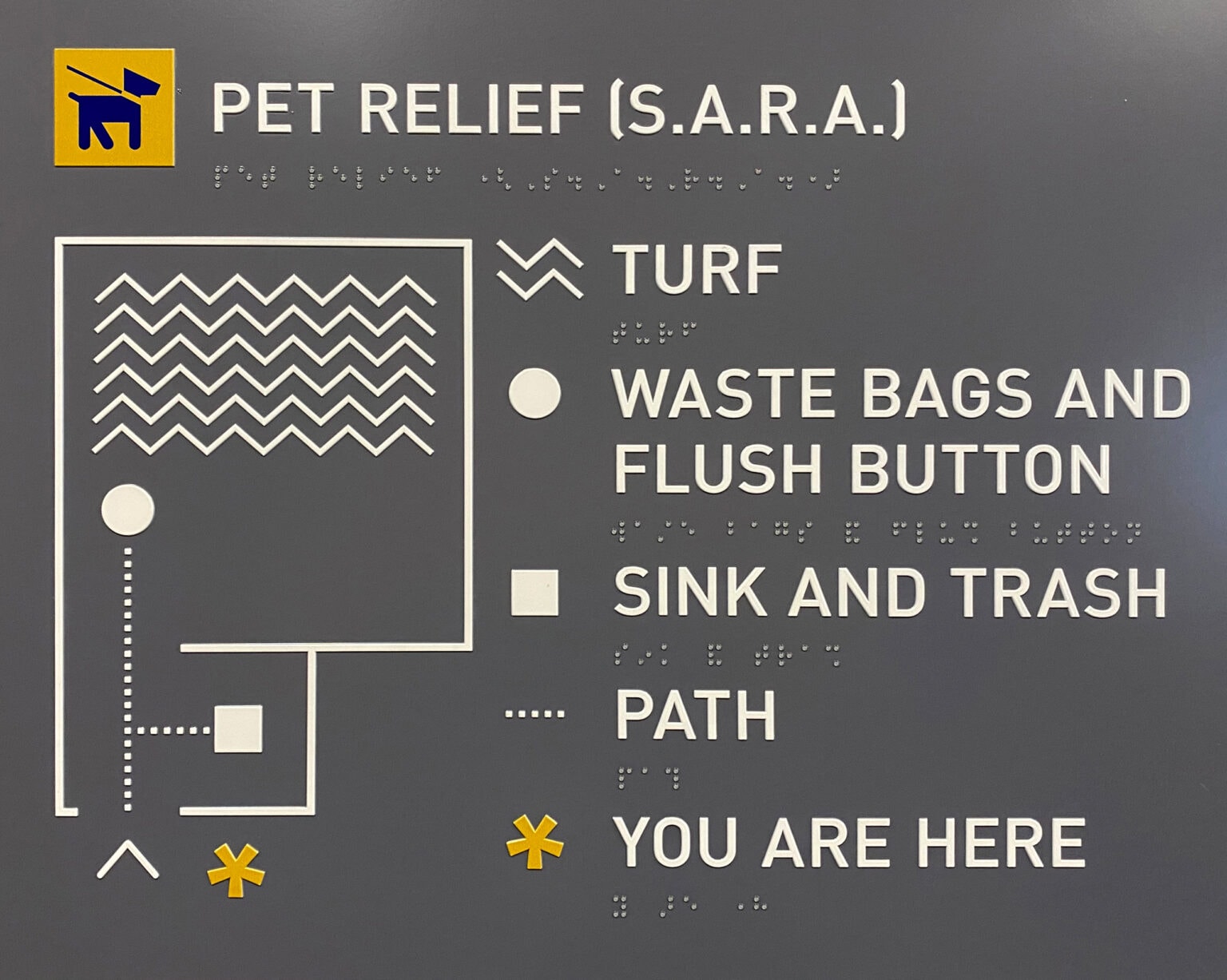
To further promote an inclusive and welcoming sensibility, MSP offers pet relief facilities for animal companions. While designing the map that accompanies this facility, we needed to communicate both the layout of the pet relief room and the features within it. Realizing that standard tactile symbols were overly complicated for users to understand by feel, we developed alternate, simpler tactile symbols based on feedback from MSP’s Travelers with Disabilities Advisory Committee (TDAC).
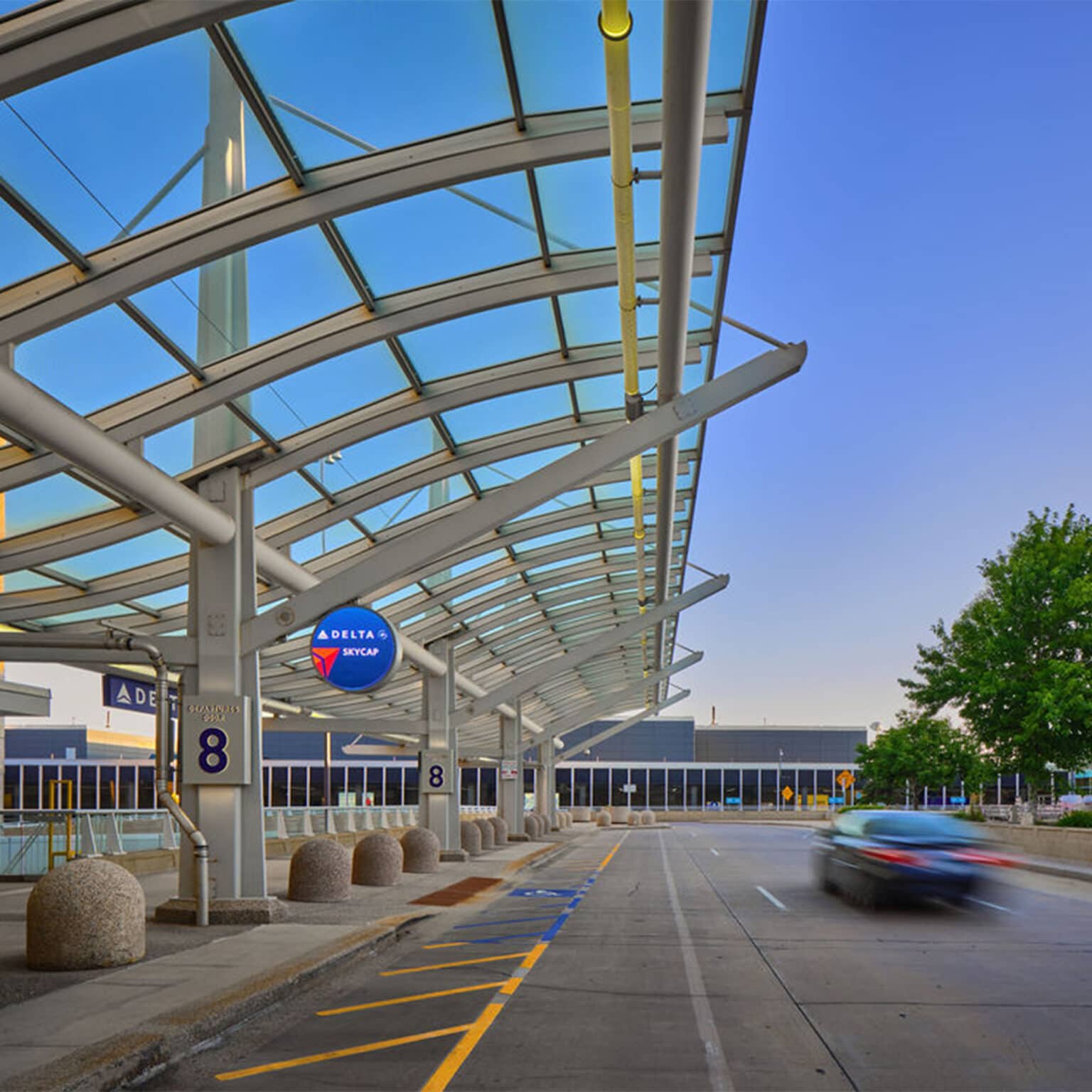
Working with MSP and its design and architecture partners has been a wonderful experience—great people to collaborate with and an amazing location to infuse a greater sense of calm, clarity, and convenience.
Find out more about Minneapolis-St. Paul Airport here.
